Last Updated on June 8, 2026 by Rosslyn Tebbutt
Every year, paint brands and design experts unveil their Color of the Year, influencing design trends for the next 12 months.
These carefully chosen shades not only reflect cultural shifts but also set the tone for how we will live, work, and relax in our homes.
In 2025, expect to see a palette that celebrates a return to nature, warmth, and mindfulness.
The top paint brands have already released their chosen hues for the year, and it’s clear that we’re leaning toward colors that are soothing, grounding, and uplifting.
Here’s a deep dive into the 2025 colors of the year by some of the biggest names in the industry.


1. Benjamin Moore: “Cinnamon Slate”
For 2025, Benjamin Moore has chosen Cinnamon Slate (a deep, earthy blend of plum and brown) as its Color of the Year.
This sophisticated and timeless hue offers warmth while remaining neutral enough to complement a variety of interior styles.
Cinnamon Slate provides a rich backdrop for any space, evoking feelings of comfort and elegance.
It pairs beautifully with soft golds, rich greens, or even deep blues, creating a harmonious blend that’s both bold and cozy.
The trend toward earthy and grounded tones continues in 2025, reflecting a collective desire to reconnect with nature and embrace spaces that offer a sense of well-being.
Cinnamon Slate’s understated elegance makes it an excellent choice for living rooms, bedrooms, or accent walls.

2. Sherwin-Williams: “Quietude”
Sherwin-Williams has chosen Quietude (a soothing sea-glass blue with gray undertones) as its 2025 Color of the Year.
This serene hue brings a calming atmosphere to any room, offering tranquility and peacefulness—ideal for spaces where relaxation and rejuvenation are key, such as bedrooms, bathrooms, and home offices.
Quietude evokes the calming influence of the sea and sky, making it a timeless, versatile option that will complement many styles.
Whether paired with crisp whites, warm neutrals, or even deeper tones like navy, Quietude will transform any space into a serene retreat.
With a growing focus on mental wellness and mindfulness in 2025, this tranquil blue will help create environments that promote peace and clarity.

3. Pantone: “Mocha Mousse”
Pantone’s Color of the Year for 2025 is Mocha Mousse.
This warm, rich brown hue evokes the comforting qualities of cacao, chocolate, and coffee, aiming to provide a sense of nurturing and indulgence.
Leatrice Eiseman, Executive Director of the Pantone Color Institute, describes Mocha Mousse as embodying “thoughtful indulgence, sophistication, and unpretentious classicism,” reflecting a desire for comfort and simple pleasures in contemporary design.
Mocha Mousse aligns with the rising trend of “quiet luxury” in fashion and interior design, characterized by subdued, earthy tones.
Its versatility makes it suitable for various applications, from home decor to fashion accessories.
In interior spaces, it complements natural materials and offers a harmonious, calming effect.

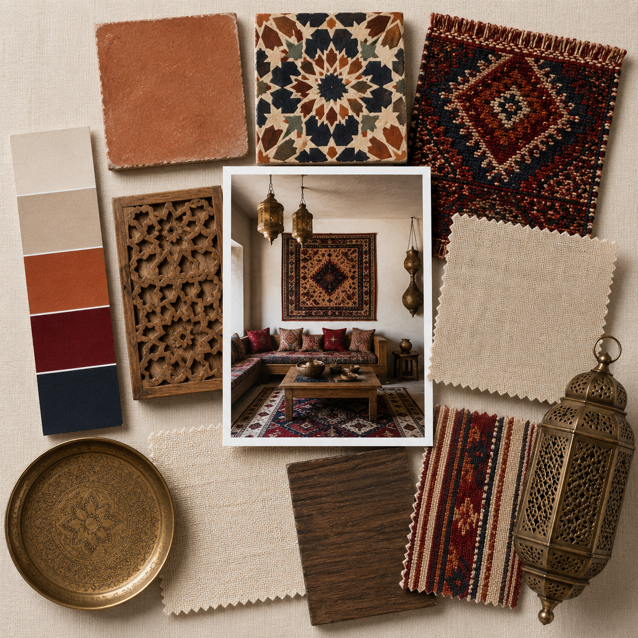
4. Behr: “Rumors”
Behr’s 2025 Color of the Year is Rumors, a deep, dramatic ruby red that adds a touch of elegance and intensity to any room.
Rich and luxurious, Rumors is a bold color that can transform a space, making it the perfect choice for accent walls, dining rooms, or cozy living rooms.
This hue speaks to the growing desire for spaces that reflect passion and creativity.
Rumors pairs beautifully with neutral tones, such as soft grays, whites, or even taupes, creating a balanced and sophisticated interior.
It also works wonderfully with gold or brass accents, enhancing its luxurious feel.
As people seek bolder, more expressive color choices in 2025, Rumors offers a dramatic yet timeless option.

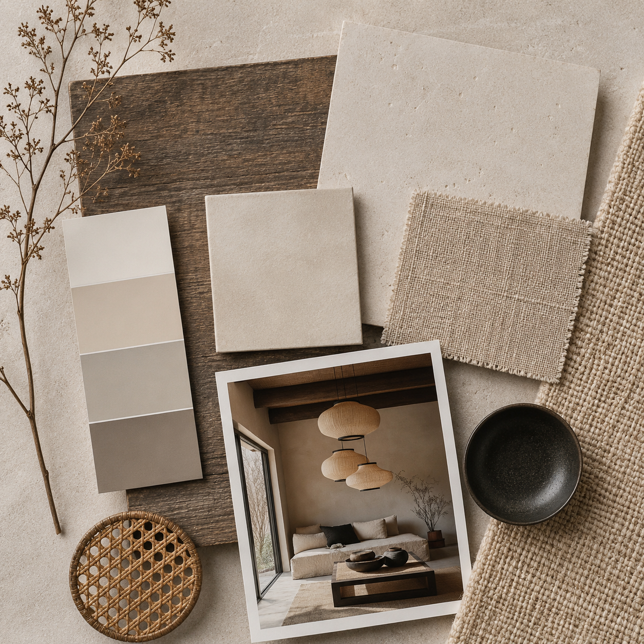
5. Dunn-Edwards: “Caramelized”
Dunn-Edwards has selected Caramelized, a warm terracotta with peachy undertones, as its 2025 Color of the Year.
This inviting and sunbaked hue exudes warmth and coziness, making it perfect for creating intimate spaces that feel welcoming and grounded.
Caramelized adds a touch of vintage charm and can be used to create a comfortable, lived-in look.
This color works beautifully with other warm tones, such as soft browns, ochres, and oranges, but can also be paired with cooler neutrals to create balance.
Caramelized is an ideal choice for spaces that embrace a more earthy, organic aesthetic, making it a popular option for living rooms, kitchens, or home offices.

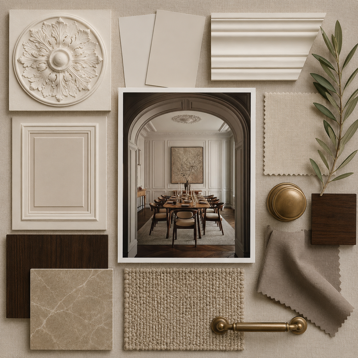
6. Farrow & Ball: “Stone Blue”
Farrow & Ball’s Color of the Year for 2025 is Stone Blue, a muted yet sophisticated blue-gray that evokes calm and serenity.
This understated hue draws inspiration from natural stone and coastal elements, offering a timeless quality that can complement both modern and traditional interiors.
Stone Blue is perfect for spaces where tranquility is essential, such as bedrooms or living rooms.
This versatile color pairs beautifully with soft whites, deep charcoal, or even earthy greens, creating a balanced and cohesive look.
Stone Blue’s subtlety makes it an ideal choice for those looking to create a serene, timeless space that promotes relaxation and peace.

Trends to Watch in 2025 Color Palettes
In addition to these standout colors of the year, 2025 promises a broader color palette that reflects a collective desire for balance, wellness, and connection with nature.
Key trends to watch include:
- Earthy tones: Warm browns, deep reds, and soft ochres are making a comeback, celebrating the grounding qualities of nature.
- Nature-inspired greens: From soft sage to rich emerald, green continues to dominate as people embrace biophilic design and eco-conscious living.
- Serene blues: Calming shades of blue, from pastel to navy, will remain popular for creating relaxing, peaceful environments.
- Vibrant accents: While muted tones dominate, pops of vibrant color—like deep ruby red and soft peach—are being used to inject energy and optimism into spaces.


Conclusion
From calming blues to grounding earth tones and vibrant accents, the colors of the year reflect our collective desire for peace, connection, and joy.
By incorporating these hues into your home, you can create spaces that promote well-being, foster relaxation, and inspire creativity.
Whether you’re planning a full redesign or simply updating a few rooms, the 2025 color palette offers endless possibilities to refresh and rejuvenate your space.
Embrace the warmth of Cinnamon Slate, the serenity of Quietude, or the optimism of Mocha Mousse, and let these hues transform your home into a haven of style and comfort.
Also, read more about Pantone’s Color of the Year here.