Last Updated on June 8, 2026 by Rosslyn Tebbutt
Remember color drenching, the trend that saw us embrace single-hue saturation across entire rooms?
Well, get ready for a double dose of color because double drenching is here, and it’s taking bold design to a new level.
Little Greene, the UK-based paint company known for its rich palettes and commitment to color, introduced this daring approach.
They propose a bold move: using two or more related colors throughout a space to create a dramatic effect.
And let’s be honest, we’re doubly intrigued.
“Since introducing color drenching, we’ve seen a shift away from traditional schemes,” says Little Greene’s creative director Ruth Mottershead.
“Customers are embracing deep and mid-tone hues, painting everything from floors to ceilings.
Double drenching builds on this color confidence, pushing the concept further with a highly creative and nuanced approach to decoration.”
But hold your horses before rushing to your local paint store.
While double-drenching might sound intimidating, it’s manageable with the right approach.
Here’s what you need to know about this bold trend.


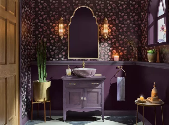
What Exactly is Double Drenching?
Think of it as color drenching on steroids.
Instead of a single hue, you employ a carefully chosen duo (or trio) of complementary colors.
Consider it an immersive color experience where every surface, from walls and ceilings to window treatments and even light fixtures, becomes a canvas for your chosen palette.


How to Double Drench Your Home
The key to successful double-drenching lies in understanding color harmony.
Mottershead emphasizes the importance of analogous color schemes, which means choosing colors near each other on the color wheel.
This creates a sense of balance and visual flow, ensuring your space feels cohesive rather than chaotic.
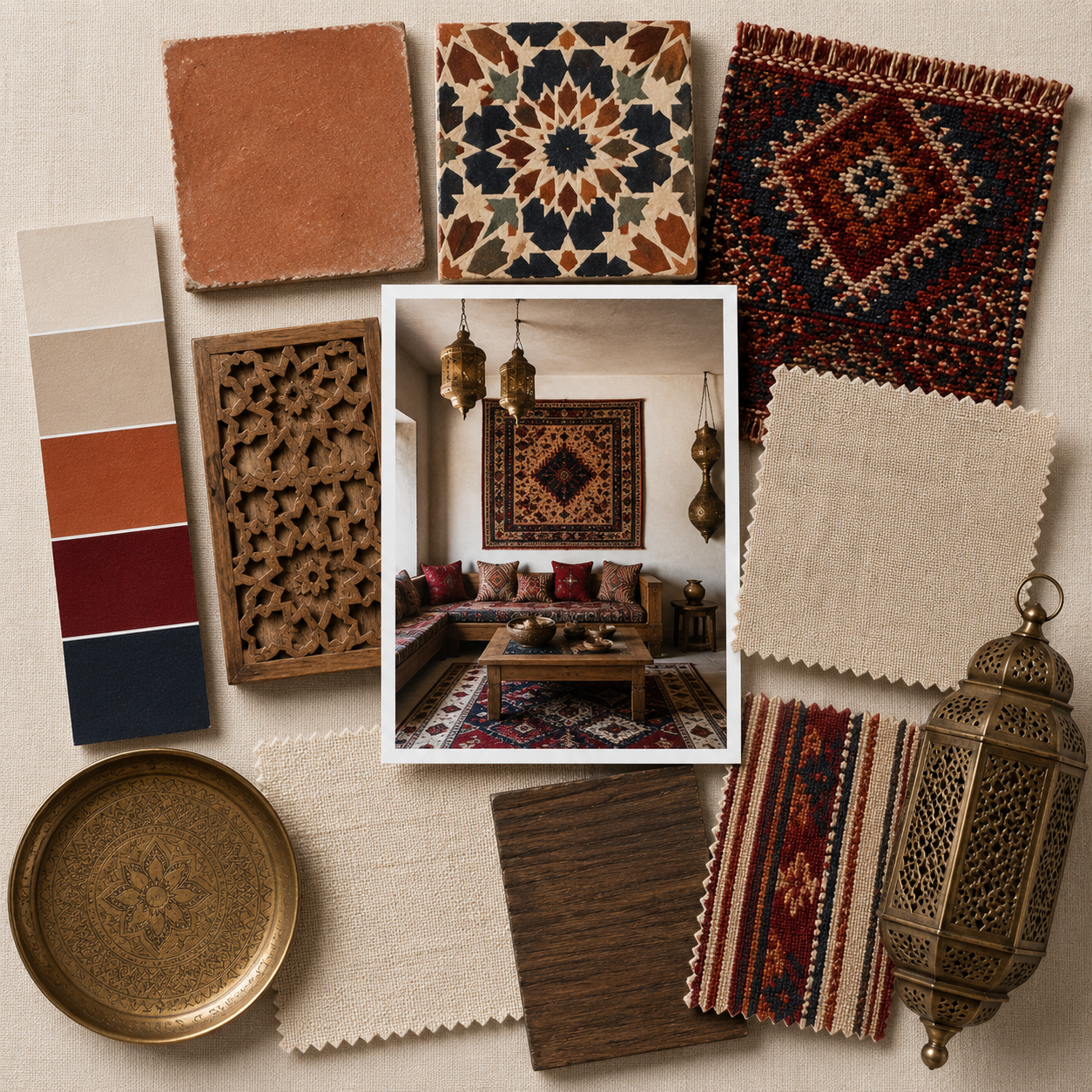
For example, imagine a room in which rich navy blue graces the walls and darker indigo adorns the ceiling.
Paint the window and door frames a vibrant cobalt blue for a final touch.
Little Greene’s Royal Navy, Dock Blue, and Smalt would be ideal for this combination, providing subtle contrasts that add visual interest without feeling overwhelming.
“Each shade complements the other,” Mottershead explains.
“It creates a balanced and serene environment conducive to relaxation and sleep while retaining character and personality.”


Embrace Elegance with Mochi: Transform Your Space for 2025
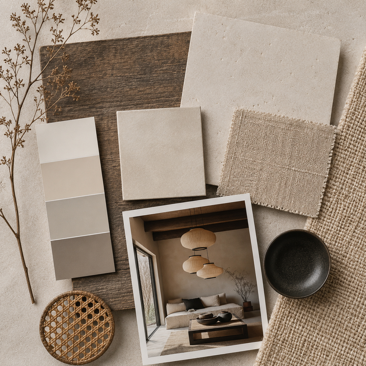
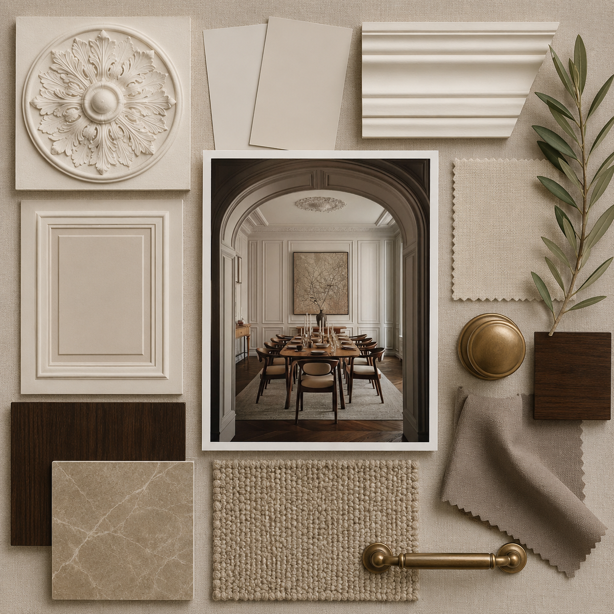
Little Greene’s 2025 Color of the Year, Mochi, is poised to revolutionize interior design.
This soft, complex, neutral, inspired by Calke Abbey’s dining room’s neoclassical charm offers a perfect blend of historical allure and contemporary versatility.
Its gentle tones provide an inviting backdrop that seamlessly enhances any decor style, making it an ideal choice for color-drenched schemes.
Consider pairing Mochi with a rich, muted sage green for a complementary second color.
This combination creates a serene and harmonious environment, allowing Mochi’s softness to shine while the sage adds depth and a touch of nature.
Imagine a room where Mochi graces the walls, creating a tranquil ambiance, while sage accents on the ceiling or window treatments inject fresh, calming energy.
Ruth Mottershead notes, “Mochi works beautifully in kitchens, bedrooms, bathrooms, and living rooms, creating a restful atmosphere.”
You’ll embrace the double-drenching trend by integrating this lovely hue with a subtle yet bold accent while crafting a timeless and modern space.
Dive into the elegance of Mochi, and let your creativity flourish!


Elevating Your Space with Double Drenching: Embrace Colors of the Year 2025
As we explore the 2025 Colors of the Year, consider the striking potential of double drenching with Violet by Minwax and Rumors by Behr.
These bold hues offer a unique opportunity to create a captivating environment that speaks to modern design sensibilities while celebrating richness and depth.
Violet, a jewel tone characterized by deeper saturation, pairs beautifully with complementary colors such as soft lilacs or muted grays.
Imagine a space where the deep violet walls create a dramatic backdrop while the lighter lilac accents on the ceiling or trim add a layer of sophistication and elegance.
This combination can evoke feelings of luxury and creativity, making it perfect for a living room or a home office where you want to inspire relaxation and energy.
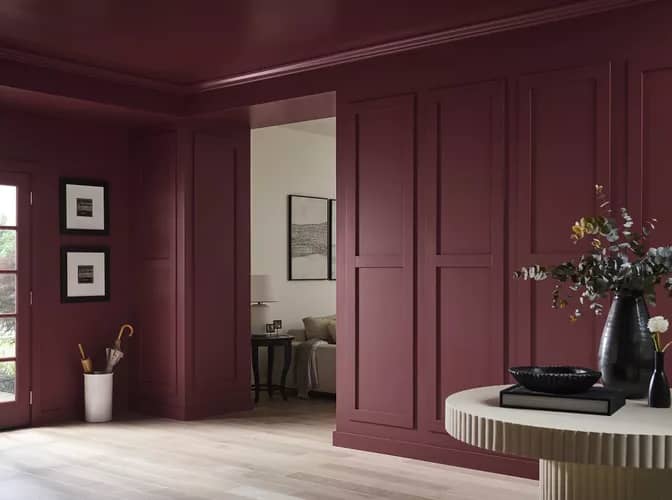
On the other hand, Rumors, with its vibrant ruby-red tones, calls for a more dynamic pairing.
Complement this bold hue with deep navy or charcoal gray. Picture a room featuring bold ruby-red walls and a deep navy ceiling that draws the eye upwards, creating a sense of depth while maintaining a cohesive and balanced feel.
This pairing captures the energy of a more modern aesthetic while simultaneously offering warmth and comfort, making it ideal for spaces like dining areas or social lounges.
By combining Violet and Rumors through thoughtful double drenching, you can transform your home into a sanctuary that reflects your personality and style.
Let these rich colors work together to create a visually arresting yet harmonious design that celebrates the beauty of color.
Beyond Analogous Schemes
Double drenching isn’t limited to subtle pairings.
For those seeking a bolder approach, contrasting colors can create a powerful visual impact, embracing the spirit of last year’s “Barbenheimer” trend.
Imagine the drama of a deep burgundy wall paired with a bright, sunny yellow ceiling – a statement that will turn heads.


Tips for Double-Drenching Success
Start small:
- If you’re hesitant about fully committing to double drenching, try it in a smaller space like a powder room or a hallway.
Consider the light:
- Natural light can affect how colors appear, so make sure to test your chosen palette in different lighting conditions.
Don’t be afraid to experiment:
- Double drenching is all about embracing color confidence.
- Try pairing shades you wouldn’t normally consider and see what unexpected combinations emerge.


Conclusion
Double drenching is a trend worth exploring because of its versatility and capacity to transform a room into a captivating space.
It’s a move for those who dare think beyond traditional decorating norms and embrace the power of color to create truly unique and impactful spaces.
So, dive into a world of color, and let your double-drenching journey begin!