Last Updated on March 26, 2026 by Rosslyn Tebbutt
Color is more than a design choice. It impacts how we feel, think, and interact with home spaces.
Choosing the right colors can set the stage for a harmonious and welcoming environment for homeowners.
Whether it’s a warm, inviting entryway or a calming bedroom, understanding the psychological effects of color can help you create a home that enhances mood and style.
Here, we’ll dive into the psychology behind popular colors and give you ideas on how to use them effectively in each room of your home.

The Power of Color Psychology in Home Design
Colors influence us deeply psychologically, often without us realizing it.
They can impact energy levels, stress, creativity, and even how comfortable we feel in a space.
Selecting colors based on their psychological effects allows you to tailor your home to reflect your lifestyle, values, and emotions.
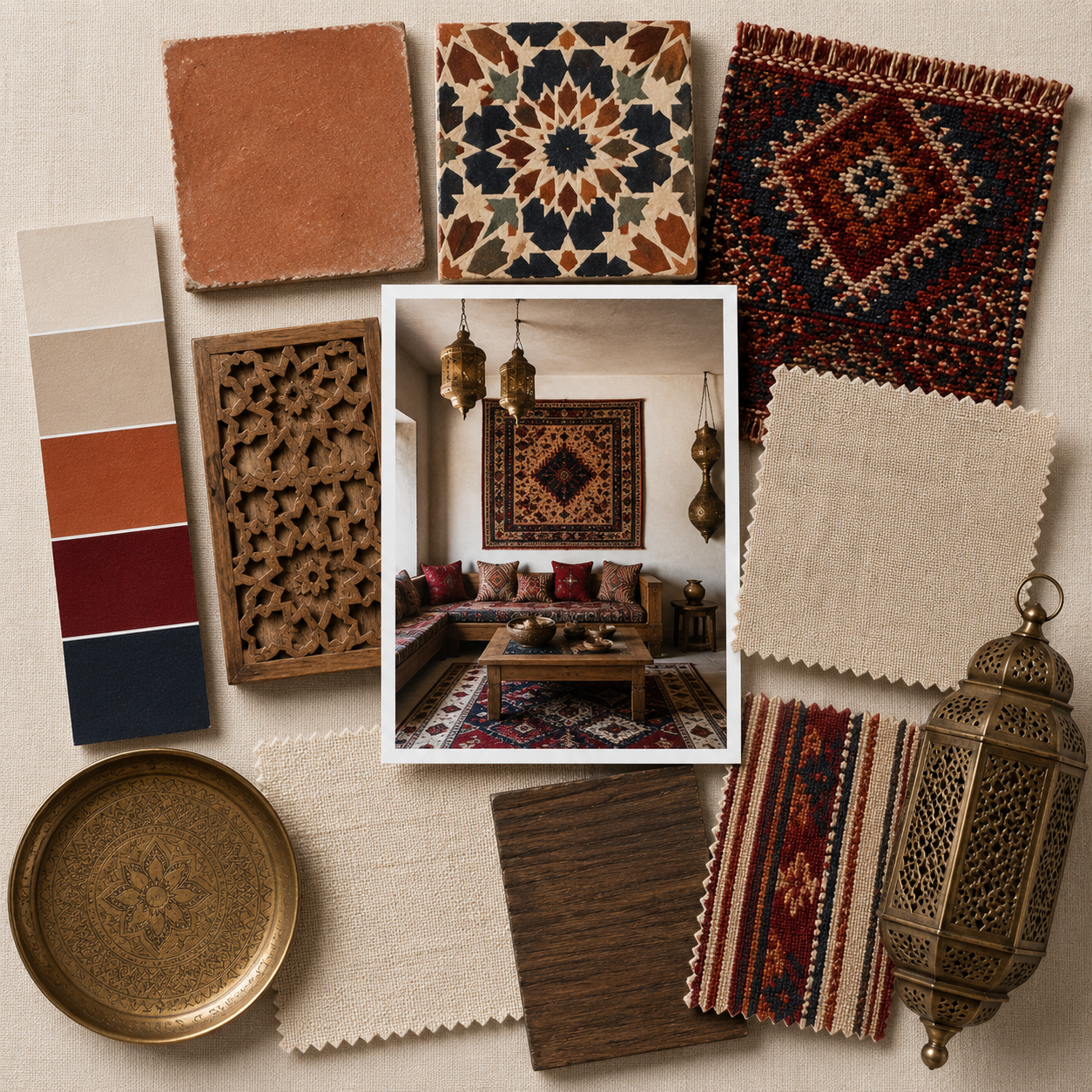
For example, blues and greens often convey calmness, while reds and oranges can add energy and passion.
Understanding these associations can help couples make mindful choices to set the right tone throughout their home.


The Psychological Effects of Popular Colors
Let’s break down the primary colors and their psychological effects.
Each color brings a unique energy, so let’s explore how to use these hues to create a mood that fits each room’s purpose.
Blue: Calming and Trustworthy
Blue is widely known for its calming effect.
It’s associated with serenity, trust, and stability, making it ideal for areas where you want to unwind, such as the bedroom or bathroom.
- Bedroom: Light blues can make a room feel spacious and peaceful, promoting restful sleep. Use deeper shades of navy for a more romantic vibe.
- Bathroom: Aqua and pastel blues evoke a spa-like, refreshing atmosphere. They can make a small space feel larger and more open.
- Kitchen: Light blue can give a kitchen a fresh, clean feel. But if you prefer warmer tones for a more inviting cooking space, use blue as an accent.

Green: Refreshing and Harmonious
Green represents balance, growth, and tranquility. It brings the outside in, making it an excellent choice for rooms where relaxation or productivity is critical.
- Living Room: Sage or olive greens create a grounded, earthy feel, fostering relaxation. This is an excellent choice for a cozy living room or family area.
- Home Office: Green is known to boost concentration and reduce eye strain. Incorporate it into a home office to enhance productivity.
- Kitchen: Muted green cabinets can add freshness to your kitchen, pairing beautifully with natural wood tones for an organic look.

Yellow: Cheerful and Inviting
Yellow is associated with happiness, energy, and warmth.
However, too much yellow can be overwhelming, so use it thoughtfully.
- Entryway: A yellow entryway makes an inviting first impression. It creates a warm welcome that sets a cheerful tone as soon as you enter.
- Kitchen: Yellow works well in kitchens, adding a sense of brightness and positivity. Soft, buttery yellows can make the space feel sunny and welcoming.
- Bathroom: Light yellow can add a cheerful glow, but avoid very bright yellows, which may feel harsh in a small bathroom space.

Red: Passionate and Energizing
Red is powerful and stimulating, known for increasing energy and promoting social interaction.
However, it can be intense, so consider where you use it.
- Dining Room: Red is believed to stimulate appetite and conversation, making it a popular choice for dining rooms. Deep reds add warmth and an intimate feel to the space.
- Living Room: Use red as an accent, perhaps through throw pillows or artwork, for a lively, energetic vibe.
- Bedroom: Red can be a bold choice for a romantic bedroom, but use it sparingly. Consider pairing it with softer, neutral tones to balance its intensity.

Orange: Warm and Playful
Orange combines the energy of red with the warmth of yellow, creating a playful, uplifting feel. It’s ideal for spaces where you want energy and interaction.
- Exercise Room: Bright orange is known to increase energy, making it great for an exercise room or area where you need a motivational boost.
- Kitchen: Earthy, muted oranges like terracotta add warmth and rustic charm. They pair well with natural materials like wood and stone.
- Living Room: Use orange in small doses, like in accent walls or decor, for a warm, welcoming atmosphere without overpowering the room.

Purple: Creative and Luxurious
Purple is often linked with creativity, luxury, and spirituality.
Depending on the shade, it’s a versatile color that can feel regal or playful.
- Bedroom: Soft lavender or deep plum adds a touch of romance and sophistication. Purple is also a calming color, making it a good bedroom choice.
- Bathroom: Light purple adds an elegant touch to a bathroom, especially with white or silver accents.
- Living Room: Purple is a unique choice that can spark creativity. Use it to add an artistic flair, especially in entertaining or relaxing spaces.

Gray: Neutral and Balanced
Gray is a modern, versatile neutral that creates a calming, balanced environment. It pairs well with almost any color and offers a sense of sophistication.
- Living Room: Gray walls or furniture provide a neutral backdrop, allowing you to play with accent colors through pillows, rugs, and art.
- Bathroom: A gray bathroom feels clean and modern. Opt for shades of light gray for a minimalist look or darker gray for a moodier effect.
- Bedroom: Gray can feel both cozy and sophisticated in a bedroom. Depending on your mood, pair it with warm or cool tones.

White: Clean and Fresh
White symbolizes purity, cleanliness, and simplicity. It can make a space open and bright but also stark if overused.
- Kitchen: White kitchens are popular for their clean, timeless look. To add warmth, use wood accents or colorful appliances.
- Bathroom: White bathrooms feel fresh and spa-like. Add warmth with brass fixtures, greenery, or textured towels to avoid a sterile look.
- Bedroom: White in a bedroom can feel refreshing and airy. Soft textiles and a mix of textures will help it feel cozy rather than cold.

Black: Bold and Sophisticated
Black is bold and sophisticated, adding depth and drama. It’s powerful, so use it intentionally for maximum impact.
- Entryway: A black entryway feels dramatic and makes a solid first impression. Consider pairing it with brass or gold accents for a luxe touch.
- Bathroom: Black bathrooms are becoming a popular trend. Dark tile or walls can add elegance and a spa-like feel to a small space.
- Living Room: Use black in furniture or accent walls to add a touch of modern sophistication. Pair it with lighter tones to prevent it from feeling too heavy.

Tips for Using Color in Your Home
Selecting the right colors for your home can be fun and rewarding.
Here are some practical tips for choosing colors that support the mood you want:
- Consider Natural Light: Rooms with plenty of natural light can handle bolder colors, while darker rooms may benefit from lighter tones to avoid feeling closed in.
- Balance Bold Choices with Neutrals: Pair vibrant colors with neutral tones to create a harmonious look. For example, balance a deep green wall with white or beige accents.
- Use Color to Define Spaces: Open floor plans can benefit from using color to define different areas. For instance, you could paint your dining area differently than your living room to create distinction.
- Layer Textures for Depth: Colors look different depending on their texture. Use a mix of matte, glossy, and textured surfaces to add depth and dimension to your design.
- Experiment with Accents: If you’re hesitant to commit to a bold color, try using it in smaller accents like pillows, rugs, or artwork. This allows you to introduce color without overwhelming the space.


Conclusion
Understanding color psychology can transform the way you design your home.
By choosing shades that reflect the atmosphere you want, you create a space that’s not only beautiful but also emotionally supportive.
From calming blues in the bedroom to energizing yellows in the kitchen, colors profoundly influence your day-to-day experience.
So, let color inspire your home design and make each room a place where you feel genuinely at ease.