Last Updated on June 12, 2026 by Rosslyn Tebbutt
Spring 2025 is all about color balance. This season, the color trends embrace both vibrant and muted hues, creating dynamic yet harmonious spaces.
Homeowners and interior designers can expect a refreshing mix of warm, earthy tones, soft pastels, and bold, dramatic shades.
If you’re looking to refresh your space, here’s how to incorporate the latest color trends seamlessly.


Color Palette for Spring 2025
This season’s palette consists of rich and sophisticated colors that blend natural warmth with contemporary vibrancy. The standout shades include:
- Mocha Mousse – A warm and inviting brown that grounds any space.
- Pink and Apricot – Soft yet energetic hues that bring a fresh, uplifting vibe.
- Chartreuse – A bold, citrusy green that adds a modern edge.
- Pistachio Green – A muted green with a calming effect, perfect for serene spaces.
- Softer Pastels – Think lavender, powder blue, and blush, which add lightness and elegance.
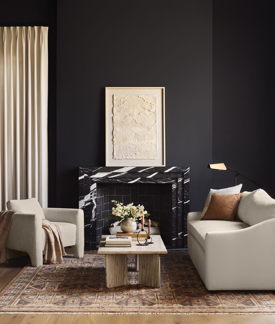
- Bold Blacks – Deep, dramatic blacks enhance contrast and create striking interiors.


How to Use These Colours in Your Space
1. Earthy and Warm Neutrals for Cozy Interiors
Mocha Mousse provides the perfect foundation for a cozy, timeless interior.
Use it on walls for a sophisticated backdrop or incorporate it through furniture and textiles for warmth.
Pair it with soft apricot or blush tones to create a welcoming and layered look.
2. Energizing Pops of Color
Chartreuse and pink make bold statements in any room. Use chartreuse for an accent wall, kitchen cabinetry, or statement furniture pieces.
A pink or apricot sofa, ottoman, or throw pillows can inject a playful and modern touch.
3. Soft Pastels for a Serene Atmosphere
Pastel shades like lavender, powder blue, and pistachio green bring a soft and tranquil feel to bedrooms and living spaces.
Consider pastel-coloured curtains, rugs, or accent chairs to create a balanced, airy environment.
4. The Power of Black Accents
Bold blacks add depth and sophistication. Use black window frames, light fixtures, or furniture to contrast against softer hues.
A black kitchen island or cabinetry can elevate a space while maintaining a modern aesthetic.

Understanding the Spring 2025 Color Trend Shift
This season’s palette blends warmth and vibrancy, moving away from purely neutral tones to incorporate energetic and grounding hues.
Designers are embracing a mix of colors that evoke both nature and modern aesthetics.


Why These Colors Work Together
The combination of rich earth tones, playful pastels, and deep blacks creates a well-balanced interior.
Earthy shades provide warmth, pastels soften the space, and bold blacks add contrast and definition.

Best Rooms to Incorporate Spring 2025 Colors
- Living Rooms: Mocha Mousse walls with chartreuse or pink accent furniture.
- Kitchens: Black cabinetry with apricot or pistachio green backsplash.
- Bedrooms: Soft pastels and warm neutrals for a calming retreat.
- Bathrooms: Apricot tiles or pistachio vanities for a fresh, spa-like feel.

Accent vs. Statement: How to Apply These Colors
- Use pistachio or pastel tones for subtle accents like throw pillows or artwork.
- Make a bold statement with chartreuse walls, black furniture, or a pink velvet sofa.

Pairing These Colors with Different Design Styles
- Modern: Bold blacks, chartreuse, and soft pastels create a sleek aesthetic.
- Bohemian: Apricot and pink tones pair beautifully with layered textures and vintage elements.
- Minimalist: Mocha Mousse and pistachio provide a subdued, calming palette.

Bringing the Palette to Life with Accessories and Décor
Incorporate these colors through:
- Decorative vases, throws, and curtains in apricot and pink.
- Lighting fixtures with black metal or warm gold accents.
- Textured rugs and cushions that blend pastels with neutrals.


Lighting and Its Impact on These Colors
Lighting can dramatically alter how these shades appear:
- Natural light enhances pastel and earthy tones, making them feel airy.
- Warm lighting deepens mocha and apricot for a cozier atmosphere.
- Cool lighting intensifies chartreuse and pistachio, making them pop.

Color Combinations to Avoid
To maintain balance:
- Avoid pairing too many bold shades together without neutral tones.
- Use black strategically to prevent overwhelming the space.
- Ensure chartreuse is balanced with soft hues to avoid an overly intense look.

Pairing Trends with Materials and Textures
- Natural Wood and Rattan – These materials enhance the warmth of mocha and apricot tones.
- Matte and Glossy Finishes – Matte black elements contrast beautifully with soft pastels, while glossy surfaces in chartreuse or pink add a contemporary feel.
- Linen and Bouclé Fabrics – Soft, tactile textures complement pastel and earthy tones, making spaces feel inviting.


Conclusion
Spring 2025’s color trends offer something for every design style, from vibrant and bold to soft and subtle.
Whether you’re making a dramatic statement with chartreuse and black or curating a serene space with pastels and warm neutrals, this season’s palette allows endless creativity.
Experiment with these colors to craft a home that feels fresh, modern, and uniquely yours.
Are you planning a spring refresh? Let us know which colors you’re most excited to use!