Last Updated on May 25, 2026 by Rosslyn Tebbutt
Interior trends change fast; it’s hard to keep up! But every interior designer (or enthusiast) on the hunt for inspiration can spot a trend while it’s still in its roots. Let’s unpack Muted Colors.

What are Muted Colors?
When you mute the sound, you make it quieter.
The same goes for the colors. When you mute a color, you reduce its vibrancy; it becomes faded, quieter, and partially desaturated.
Plain blue becomes dusky or deep sea blue; green becomes earthly green or olive, yellow transforms into dusted yellow, etc.
If you want a more subtle color presence in the interior of your home, opt for muted colors.
They will allow you to experiment with other shades, add patterns, and create texture, making your decorating choices almost endless.
Let’s glimpse some of the muted hues’ hidden powers.
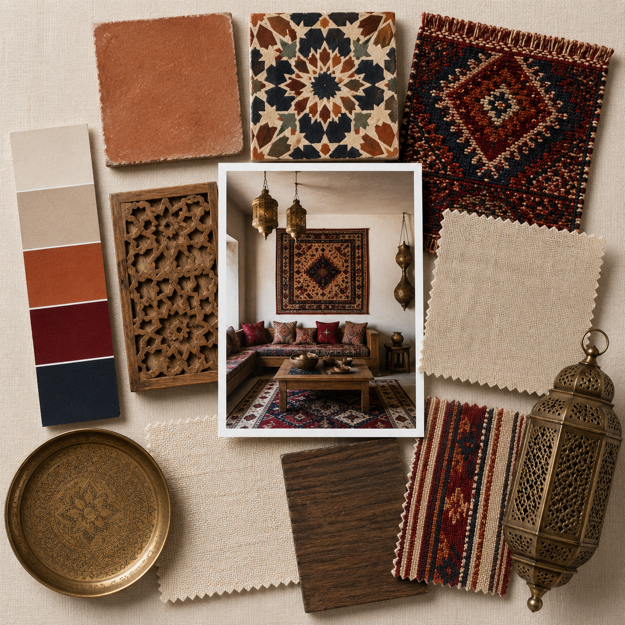
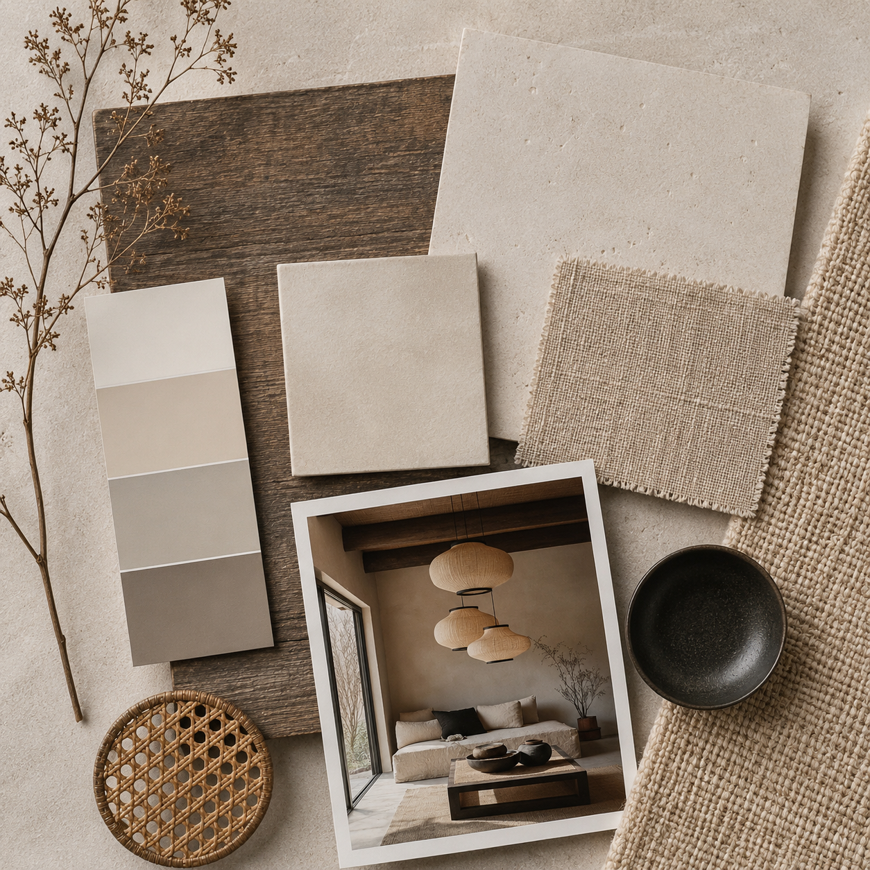
Forest Green

Green is a soothing and fresh color traditionally associated with healing. It represents nature, the very thing we all lack nowadays.
When we think of green, we usually associate it with vibrant tones (Greenery – Pantone color of the year 2017), but don’t forget its calm hues, such as olive, earthy, or seafoam green.
These subdued shades don’t shout to be noticed and work well with other earthy colors, such as muted blues and browns.
Anything looks good against them. Muted greens invite us to travel around our fantasies and make us feel relaxed and comfortable.
Deep Blues
The cold and calm blue is a trademark of the famous Scandinavian interiors.
These shades of blue also go perfectly with olive green, mustard yellow, or striking black.
To avoid turning your home Scandinavian, add details in darker shades, such as charcoal or chocolate, rather than the usual white.
It’s the best choice for a bedroom as it creates a calm atmosphere ideal for a good night’s sleep.
Timeless and stylish, Denim Drift (Dulux color of the year 2017) is one of the most versatile shades.
It can be mixed with furniture from any era, making it a perfect choice for lovers of eclectic design.
Mustard Yellow

Desaturated yellow can be used in a couple of ways.
It can be added in detail to make the design pop or be used as the dominant color. If you choose the first choice, try mixing it with gray; they make a stunning combo.
To inject some warmth into the room, throw some yellow pillows on the sofa and add a rug, picture frames, and other yellow accessories.
You will create a more welcoming environment by painting the walls in toned-down yellows.
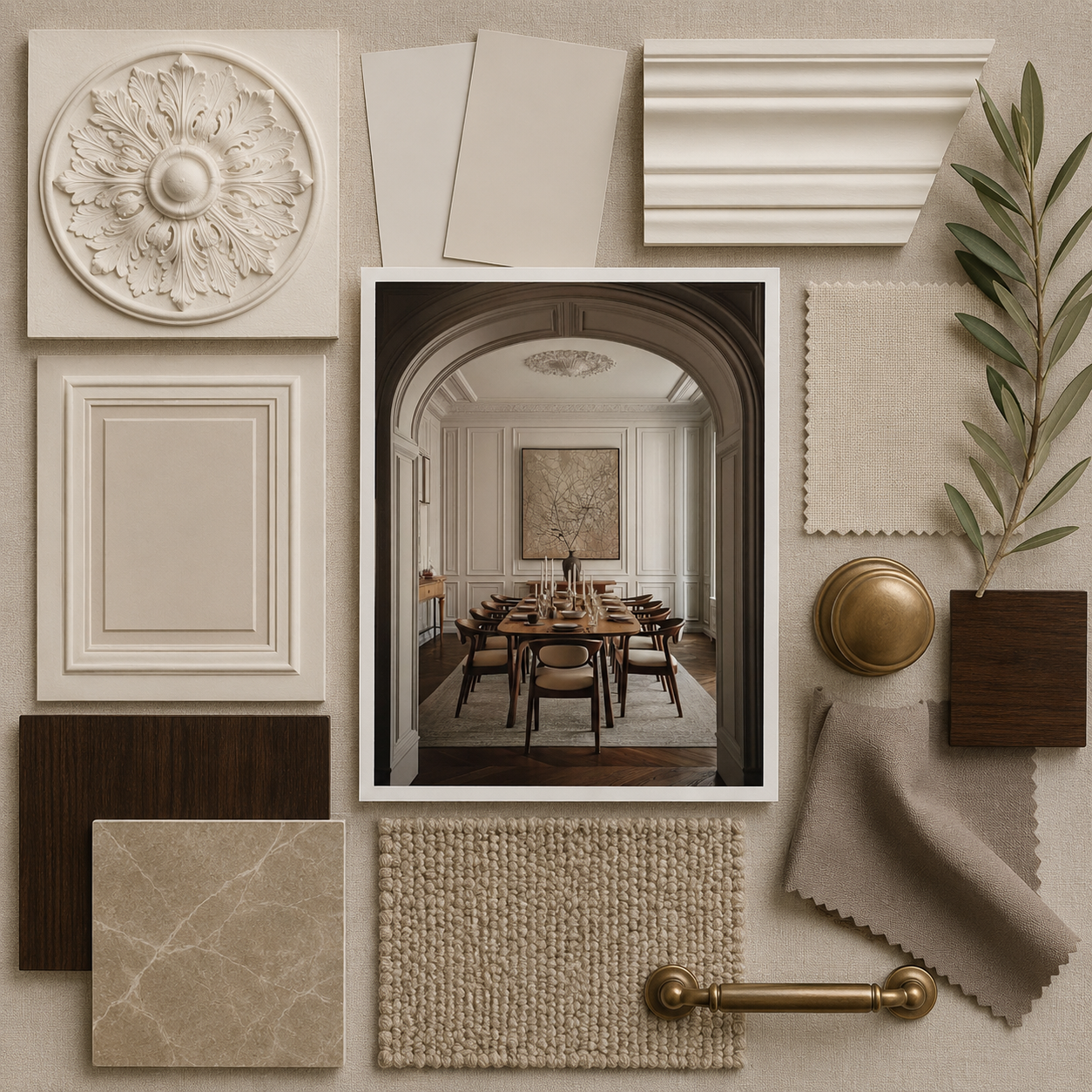
Muted colors are not the best choice for everyone. This palette won’t take your breath away if you are going for an edgier look.
But it will probably be your best bet if you want to add calm energy and warmth to your design without overwhelming the rest of the room.
Still, remember – never use trends “by the book.”
Play with it and make it yours. Only this way will it become an artwork.