Last Updated on March 26, 2026 by Rosslyn Tebbutt
Did you know that your brain is constantly scanning your surroundings?
It’s not hypervigilance exactly (unless you’ve been under tremendous amounts of stress), it’s simply how our minds operate.
Sure, we might not register this activity consciously, but it’s happening all the time nonetheless.
Here’s an example of this phenomenon you’ve more than likely experienced.
You walk into a room – it could be someone’s living room, a store, or even a museum – and you almost instantly feel relaxed, or conversely, inexplicably agitated.
This was you experiencing how your environment shapes your emotional state. We all operate on subconscious levels to some degree, like it or not!
That’s why design decisions deserve more than a passing thought. Much more, actually. The way you structure and style your space can either support or sabotage mental clarity, focus, and comfort.
Color psychology especially deserves your attention because it can greatly affect your mood.
For example, you shouldn’t pick a dusty blue for a bedroom just because it’s trending (and it is); you choose it because cooler tones can signal calm to your nervous system.
In short, to make your space more inviting and comfortable, don’t care only about aesthetics; care about aesthetics with purpose. Here’s why you should do that and how.
Image credit: Pexels

Why Color Palettes Carry More Weight Than You Think
There’s solid science behind why color psychology can affect specific emotional reactions.
For instance, there’s research showing certain colors, like blue, green, and warm hues, evoke specific emotional responses and support comfort, productivity, and well-being in living and working spaces.
This is why many therapists and designers use cooler tones like blues to promote relaxation and green plants to improve focus. It’s all science-backed.
The issue is that most people approach color selection backward. They fall in love with a trendy palette—for example, forest green with matte black—and try to retrofit the space around it.
That’s wrong; what you want to do instead is work from the inside out. In other words, ask what function the room serves, what emotional tone you want to reinforce, and how lighting might distort color perception at different times of day, and then incorporate appropriate colors.
Now, what if you’re unsure how to balance wall colors with your existing furniture?
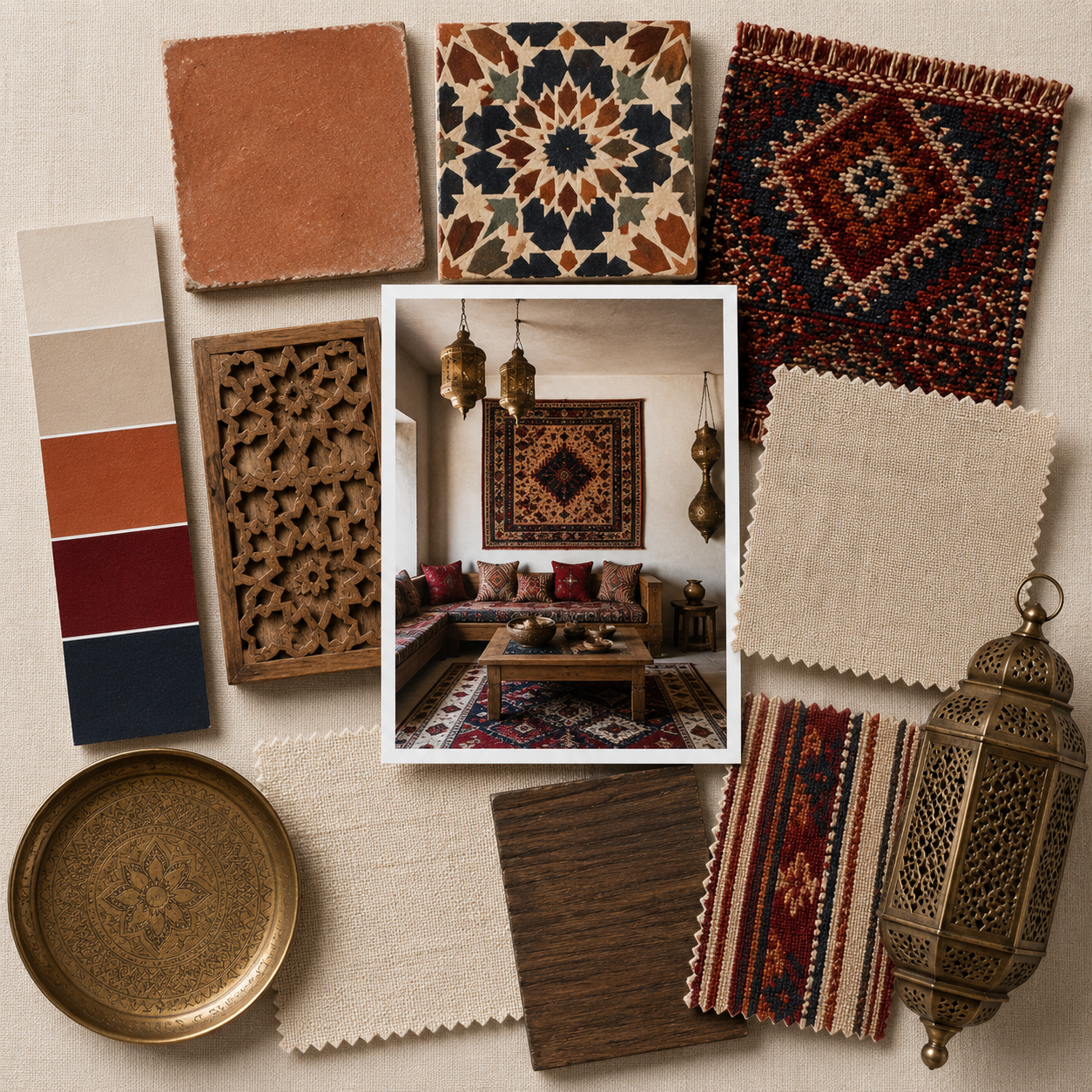
Consult a local expert who works with real-world palettes, not just digital swatches. Designers in Florida, for example, will consider Florida’s sunlight, lifestyle, and architecture.
Brothers Colors Painting in St. Pete is a great example of experts in their field, as they interpret these principles through a local lens.
After all, it’s one thing to love a charcoal accent wall on Pinterest, but if it sucks the light out of your already-narrow hallway, it’s a bad decision, no matter how trendy it is.

Interior Design Styles: Impact vs. Intention
Not every design style will feel inviting to every person, and that’s the point. Scandinavian minimalism may read as peaceful and refined to one client, but cold and impersonal to another.
So while staying “on trend” is useful, don’t let it override actual lived experience. In essence, your style choices should mirror the behaviors and energy you want to encourage in a room.
Right now, there’s a tilt toward biophilic design: using natural materials, organic shapes, and indoor greenery.
This design is more than just about aesthetics; its purpose is to psychologically mimic the calming influence of nature.


The Role of Texture, Scale, and Light
While color gets most of the attention, texture and scale are also very important, as they often determine whether a room feels balanced or uncomfortable.
Too many slick surfaces and you risk sterility. Too much plush and it starts to feel heavy.
Mixing smooth with coarse (like matte paint against raw linen or boucle next to lacquered wood) may be best because it keeps the room tactile and human.
The scale works the same way. If your sofa is oversized and your coffee table is dainty, something will feel off. It doesn’t matter if each piece is beautiful on its own.
Rooms work best when proportions speak the same language.

Paint Color by Room
Let’s get specific. If you’re redesigning, here’s practical advice to make every room fit you perfectly:
- Living Room: Earth tones like warm taupe or olive green create a grounded, conversational atmosphere. Blues can work here too, especially when balanced with warm materials.
- Bedroom: Soft and cool colors, like dusty blue, pale sage, or a warm grey, are great here. They support melatonin production and encourage mental wind-down.
- Kitchen: This is where energy matters. Whites, creams, or light neutrals keep the space fresh. Subtle yellow and red tones, which have been associated with appetite stimulation (no surprise that fast food chains overuse them) can also be great.
- Office: Pale greens and blues support focus, so opt for those. Avoid saturated reds or bright oranges as they can be overstimulating for long-term use, especially under artificial light.


Finishing Touches
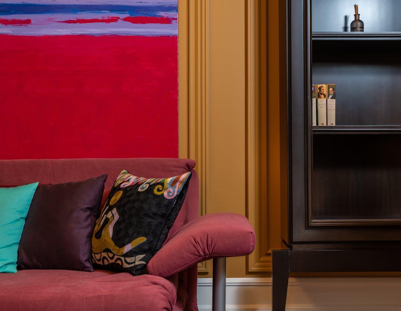
Finally, an inviting space will reflect personal context. Accent colors can break up the monotony, so cushions, art, and furniture pieces matter.
For instance, a single painted chair in a high-chroma hue can liven up any space. But don’t scatter them randomly!
Pick one or two anchor tones and repeat them intentionally throughout the space to build cohesion.
Also, please avoid showroom perfection. A few imperfections—layered books, a slightly asymmetrical lamp, a piece of inherited furniture— are where real creativity lies, as they bring humanity to space.