Last Updated on March 18, 2026 by Rosslyn Tebbutt
When it comes to home décor, color is one of the most powerful tools to set a mood—and few hues carry as much energy and emotion as red.
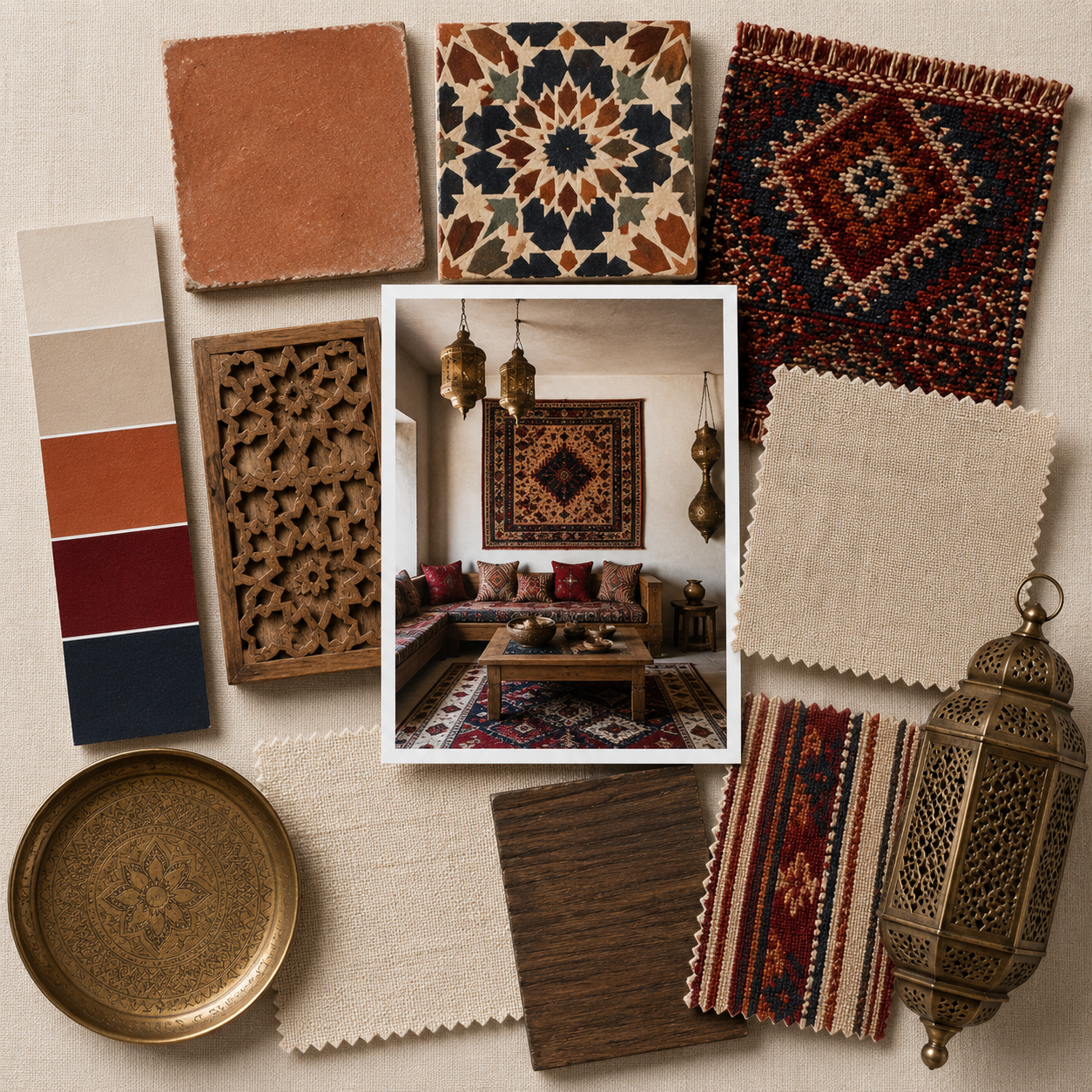
As autumn approaches, red is stepping into the spotlight, not as an all-over color but as a strategic accent that brings warmth, drama, and an unexpected edge to interiors. From cherry and scarlet to deep burgundy, red accents are proving that a little goes a long way.

Why Red Works So Well in Interiors
Red has long been associated with passion, vitality, and comfort. In design, it naturally draws the eye, acting as a visual anchor in a space.
Unlike neutrals, which fade into the background, or pastels, which soften a room, red delivers impact. Used sparingly, it elevates even the most minimal spaces with a burst of personality.
Designers are turning to red as a contrast color, using it in small doses to liven up otherwise neutral or monochrome interiors.
Think of it as the punctuation mark in a sentence—it doesn’t dominate, but it changes the tone entirely.

Where to Add Red Accents
- Furniture Details: A red side chair, coffee table, or barstool can transform a space with one bold stroke.
- Soft Furnishings: Red throw pillows, blankets, or lamp shades offer an easy, low-commitment way to experiment.
- Architectural Touches: Painted wall edges, trim work, or even a door in cherry or burgundy creates definition and depth.
- Seasonal Layers: Pairing red with winter plaids, cozy textiles, or festive gold accents keeps a home feeling warm and inviting during cooler months.


Red in Seasonal Pairings
One reason red is trending this autumn is its ability to blend with other seasonal palettes:
- With Gold Accents: Scarlet and gold together feel timeless and glamorous, ideal for living rooms or dining spaces.
- With Neutrals: A red throw on a cream sofa instantly livens up a neutral scheme without overpowering it.
- With Plaids & Patterns: Burgundy layered with wintery plaids brings a cozy, heritage-inspired charm that feels both modern and nostalgic.
Why Red Will Stay Relevant
While some colors fade as trends shift, red holds staying power. Here’s why:
- Emotional Impact: Red will always feel bold and energizing, making it a go-to accent for homeowners looking to refresh their space without a complete overhaul.
- Versatility of Shades: From playful cherry to sophisticated burgundy, there’s a red for every mood and interior style.
- Enduring in Fashion & Décor: Red is not just seasonal—it echoes trends in fashion, art, and culture, keeping it evergreen in design conversations.


How to Try the Red Accent Trend
- Start small: Add a single red vase, cushion, or artwork to see how the color plays in your space.
- Test different shades: Scarlet for vibrancy, burgundy for depth, or cherry for a playful pop.
- Use balance: Let red shine against calm backdrops—neutrals, black, or even muted greens are perfect partners.
Final Thoughts
The red accent trend is proof that sometimes less is more. By using this bold hue strategically, you can infuse your home with vibrancy, warmth, and unexpected character without overwhelming the space.
Whether it’s a scarlet trim on a lamp, burgundy pillows on a sofa, or a cherry-red door, these subtle touches prove that red isn’t just for making statements—it’s for creating homes that feel alive.