Last Updated on February 7, 2026 by Tanya Janse van Rensburg
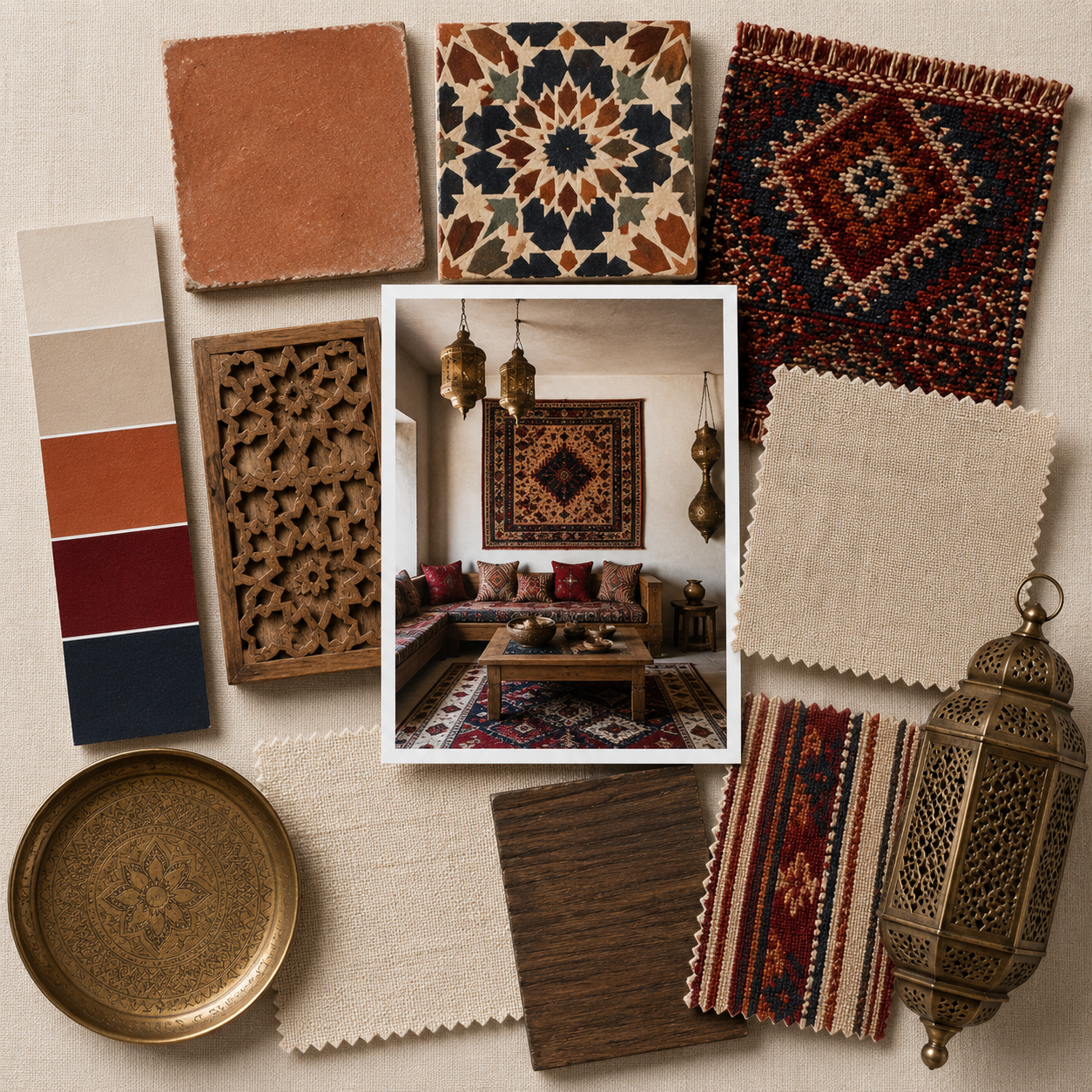
Mixing bold patterns, eclectic prints, and delightful textures is an art that brings life and character to any space.
When paired with a vibrant rainbow of colors, this approach transforms interiors into unique expressions of style and personality.
Whether you want to refresh a room or embark on a full redesign, learning how to balance patterns, prints, and textures can turn your vision into reality.
Here’s a comprehensive guide to mastering this dynamic home decor technique.


Understand the Basics of Mixing Patterns and Prints
Before diving into the mix-and-match world, it’s essential to understand some foundational principles.
Patterns and prints come in various styles, from geometric and floral to abstract and tribal designs.
Combining them requires an eye for detail and a grasp of proportion, scale, and color.
Use a Cohesive Color Palette
Begin with a cohesive color palette that guides your design.
Choose a dominant color and incorporate complementary or contrasting hues to harmonize your combinations.
For instance, if you’re drawn to a bright pink, balance it with shades like mustard yellow, turquoise, or navy blue.
The rainbow-inspired approach works best when the colors complement rather than compete with each other.
Mix Pattern Scales
The scale of your patterns plays a significant role in their compatibility.
Pair large-scale prints, like oversized florals or bold stripes, with smaller, intricate designs, such as polka dots or herringbone.
This contrast prevents visual clutter and allows each pattern to shine.
Balance Busy and Subtle Prints
Too many busy patterns can overwhelm the eye. Balance intricate designs with simpler prints to avoid creating chaos in your decor.
For instance, match a busy chevron pattern with solid-colored textures or subtle stripes.


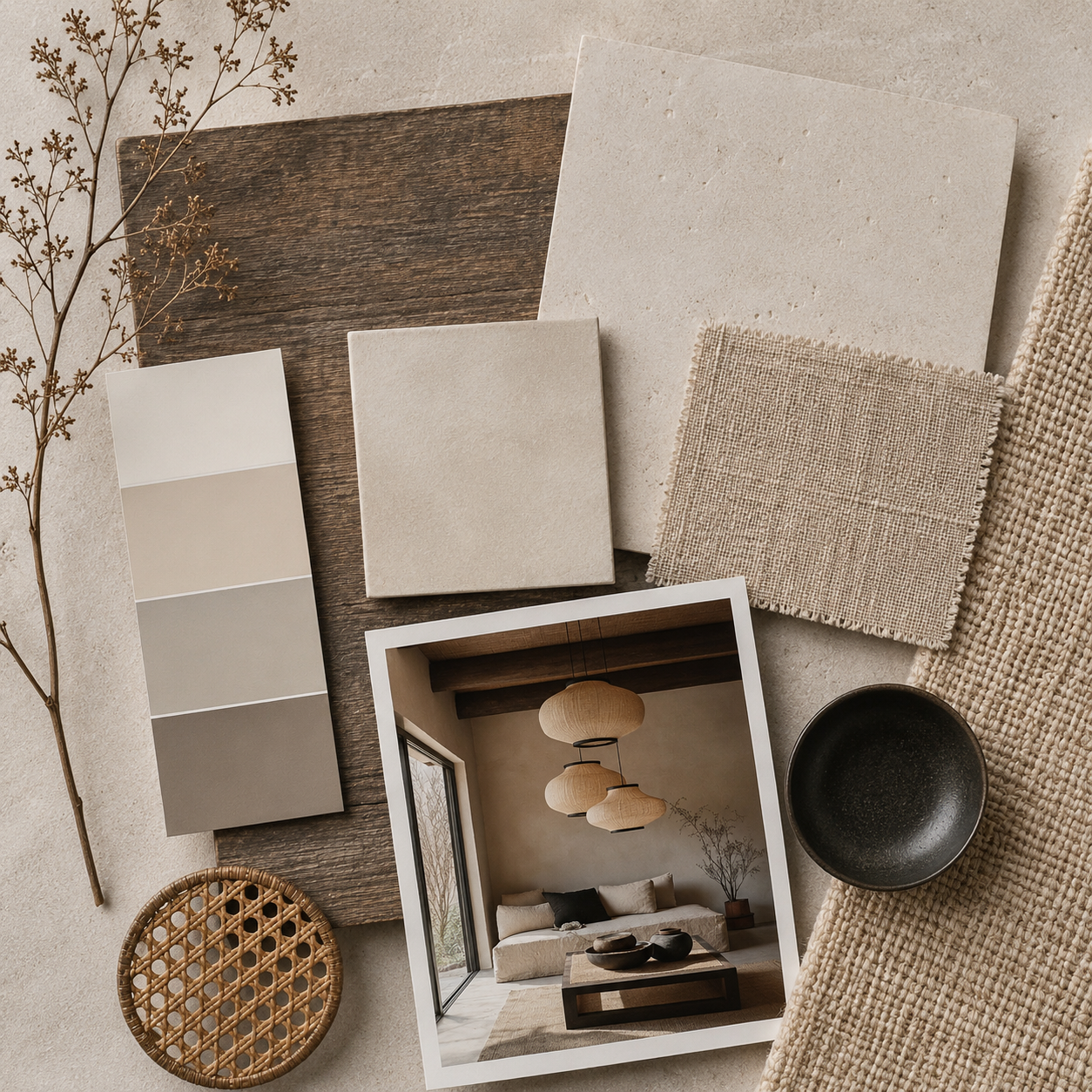
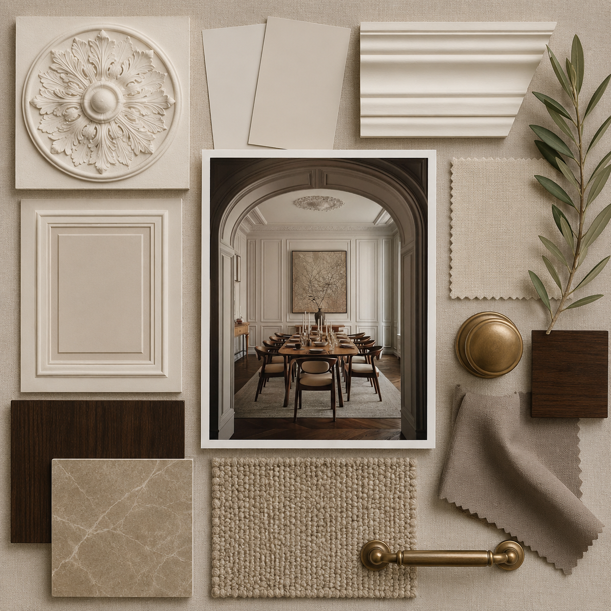
Add Delightful Textures for Depth
Textures are the unsung heroes of dynamic design. They add depth and a tactile element that enhances a room’s overall look and feel.
When combining patterns and prints, incorporating texture helps soften the visual intensity.
Layer Textures Thoughtfully
Layering textures is about mixing materials that complement your patterns.
Combine soft fabrics like velvet and silk with rougher materials such as jute, leather, or rattan.
A velvet sofa with patterned cushions or a sisal rug beneath a colorful ottoman introduces layers of texture that elevate the design.
Embrace Unexpected Textural Elements
Don’t shy away from unexpected textures like metallic accents, faux fur, or woven baskets.
These elements add a touch of surprise and can tie patterns together.
For example, metallic side tables can accentuate the colors in a bold printed rug.


Start Small to Build Confidence
If you’re new to mixing patterns, prints, and textures, starting small is a smart way to build confidence.
Experiment with smaller decor items before tackling larger elements like wallpaper or upholstery.
Use Throw Pillows and Blankets
Throw pillows and blankets are excellent for testing combinations. Mix pillows with geometric patterns, vibrant florals, and textured covers in complementary hues.
A boldly printed blanket draped over a solid-colored sofa can create an inviting focal point.
Introduce Artwork and Accessories
Artwork and accessories are perfect for incorporating bold prints without committing to larger changes.
Hang abstract prints, framed textiles, or vibrant wall art that complements the room’s palette.
Accessories like vases, trays, and decorative bowls can also showcase eclectic designs.


Combine Patterns, Prints, and Textures Across Key Decor Elements
When you’re ready to go bigger, integrate your patterns, prints, and textures across significant decor elements.
Achieving balance in each area ensures a cohesive and polished look.
Furniture
Patterned furniture, such as a boldly upholstered armchair or a printed ottoman, can serve as a statement piece in your room.
Pair it with textured throw blankets or patterned cushions to create a harmonious arrangement.
Rugs and Curtains
Rugs and curtains are ideal for introducing bold patterns in home decor.
A vibrant area rug with an abstract print can anchor the room, while patterned curtains frame the space beautifully.
Use textures like sheer drapes or woven blinds to balance busier prints.
Walls
Use patterned wallpaper or stencils on an accent wall for a dramatic impact.
If you prefer a subtler approach, use textured paint finishes that add depth without overpowering the room.
Bedding
In the bedroom, mix patterned sheets with textured throws or a quilted bedspread.
Layering these elements creates a cozy yet visually exciting environment.


Tips for Mixing Patterns and Prints Like a Pro
Repeat Colors Across Patterns
Repeating colors across different patterns ensures continuity.
For example, if you have a floral print with shades of red, blue, and green, incorporate these colors into other patterns like stripes or geometric designs.
Use Neutral Breaks
Introduce neutral elements like white, beige, or gray to break up bold combinations.
Neutral tones act as a visual pause and allow vibrant patterns to stand out without feeling overwhelming.
Follow the Rule of Three
The rule of three suggests limiting your combinations to three primary patterns.
This keeps the design intentional and focused, rather than chaotic. Choose one dominant pattern, one secondary pattern, and one accent.
Consider the Room’s Function
Think about the purpose of the room when mixing patterns. In a living room, opt for playful and inviting prints, while a bedroom may benefit from calmer, more serene designs.
For high-traffic areas, choose durable textures and patterns that can withstand everyday use.


Avoid Common Mistakes
Overloading with Color
While the rainbow approach celebrates color, overloading the space with too many competing hues can make it feel chaotic.
Stick to a balanced palette to maintain harmony.
Ignoring Proportions
Failing to balance large and small patterns can result in a mismatched look.
Always vary the scale of your patterns for a cohesive design.
Skipping Texture
Relying solely on prints without adding textures can make the design feel flat.
Incorporate textural elements to create dimension and interest.


Conclusion
Mixing bold patterns, eclectic prints, and delightful textures in all colors of the rainbow brings energy and personality to your home.
By following these tips, you’ll master the art of creating dynamic, colorful spaces that reflect your unique style.
Start small, experiment with combinations, and don’t be afraid to take risks.
With practice and creativity, you’ll create a stunning decor that feels as vibrant and inviting as a rainbow itself.