Last Updated on May 25, 2026 by Rosslyn Tebbutt
Terracotta, rust, Living Coral, burnt orange, primary red, sienna, and brown – learn all about Muted Red and its beautiful hues.
With a great comeback of color in interior design, we are ready to experiment with bold hues and more complex color schemes, such as reds.
The millennial pink craze of recent years is gradually fading, leaving space for more sophisticated and intense colors to emerge.
Pinks are maturing and taking on a spicy coat to become terracotta, sienna, burnt orange, burgundy, deep red, primary red, reddish brown, and soft red with a yellow glow.

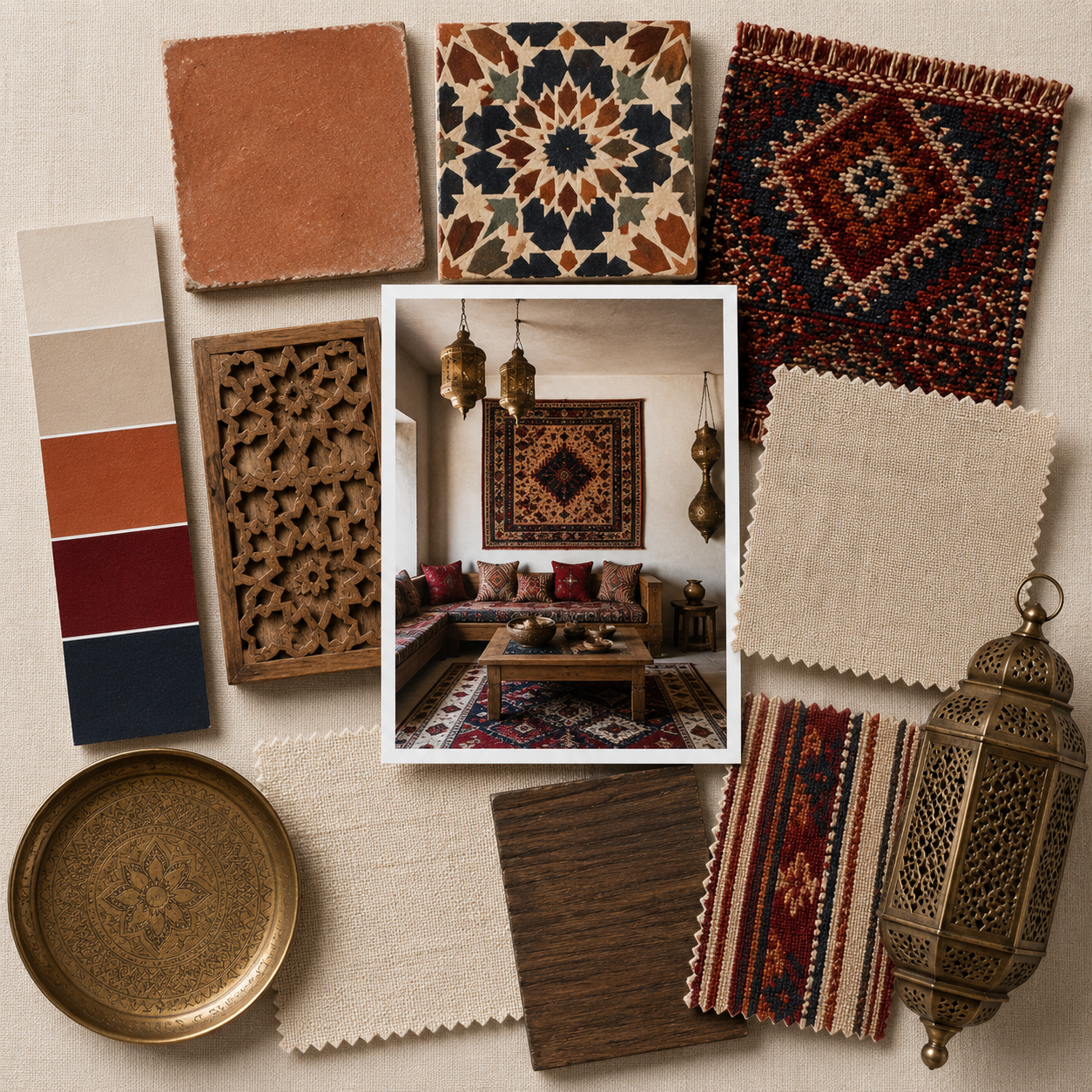
mood board made with SampleBoard
Muted Red Color in Interior Design
Terracotta, rust, and other earthy shades are driving color direction toward a new decade in which we will reinvent the way we live in our homes.
Impacting every aspect of design, new and muted reds are breathing life into our interiors and bridging the gap between the ‘70s nostalgia and modern, futuristic design.
We are seeing muted red pop up in accessories and on a larger scale, so don’t be surprised if you spot an increasing number of tone-on-tone rooms featuring some of these muted shades of red.
Tonal spaces usually feature different shades within the same color family, spiced up with fun pops of orange, mint, pink, and yellow, as well as warm metallics and warm neutrals.

mood board made with SampleBoard
How to Use Muted Red in Interiors
Matt color finishes are currently very popular, but glossy textures are expected to arise in the future. Until this happens, use golden finishes to provide interest and introduce a luxe vibe into the space.
New reds encourage us to take risks with style and patterns, leading the way into a color revolution. Rich, alluring reds can be a powerful tool for interior designers, but remember to balance them properly.
Some best practices suggest pairing bold reds with white, grey, or any other neutral to calm them down and create a more soothing environment.

mood board made with SampleBoard
But your options are almost endless if you prefer muted reds over their exotic counterparts. Muted red is a breeze to decorate with and always makes a big statement without being so over your face.

mood board made with SampleBoard
New and muted red played a prominent role at Milan Design Week in 2019, suggesting an exciting future for interior design color schemes.
Dynamic and passionate, these fiery reds are energizing and fearless, becoming warmer and more vibrant each passing season.
Will we get used to this bold interior color trend, or will it remain a hero of commercial styling sets?

Studio Marfa


Bohinc Studio at Milan Design Week 2019

Diana Wallpapered Boudoir for Ted Milano x Artemest, Milan Design Week 2019


Dezeen