Last Updated on March 26, 2026 by Rosslyn Tebbutt
From comforting neutrals to deep jewel tones, the 2026 color forecasts reveal a design shift toward palettes that support wellness, authenticity, and quiet confidence.
Major paint brands have begun unveiling their selections, and together they tell a story of balance—between calm and character, nostalgia and modernity, timelessness and personal expression.
This year’s color direction moves beyond aesthetics. It’s about how color influences mood, emotion, and connection within our living spaces.

Why 2026’s Colors Matter
In 2026, color is being treated as both a grounding force and a form of self-expression. The trends reflect a broader cultural movement toward authenticity, craftsmanship, and well-being.
1. Emotional Well-Being and Restoration
Brands are positioning color as a tool for healing, calm, and reconnection. Softer shades and earthy neutrals offer serenity in a fast-paced world.
2. Personalization Over Trend-Chasing
The “anti-trend” mindset continues to grow, encouraging homeowners to choose colors that feel personal rather than following fleeting styles.
3. Heritage and Craft Influence
Designers and consumers alike are rediscovering colors that connect to materials, history, and craftsmanship—tones that feel tactile, organic, and enduring.
4. Material Harmony
The best colors now complement natural materials—wood, stone, linen, and clay—enhancing texture instead of competing with it.

The Standout 2026 Color Picks
Here are several of the most notable Color of the Year announcements and what they represent.
Universal Khaki – Sherwin-Williams & HGTV Home

Both Sherwin-Williams and HGTV Home selected Universal Khaki for 2026, a warm, versatile beige-khaki hybrid that embodies balance and stability. It reflects a growing appreciation for foundational colors that offer comfort and structure amid uncertainty.

How to Use It:
This neutral pairs beautifully with stone, wood, or black metal accents. It works across styles—from modern minimalism to soft transitional interiors—and provides a timeless base for layering deeper tones.
Hidden Gem – Behr

Behr’s 2026 Color of the Year, Hidden Gem, is a smoky jade that shifts elegantly between blue and green depending on the light. It’s sophisticated yet approachable, offering both personality and calm.

How to Use It:
Apply Hidden Gem in kitchens, bathrooms, or living rooms as an all-over color or as an accent on cabinetry and walls. It pairs beautifully with brass hardware, dark wood, and creamy whites for a balanced palette.
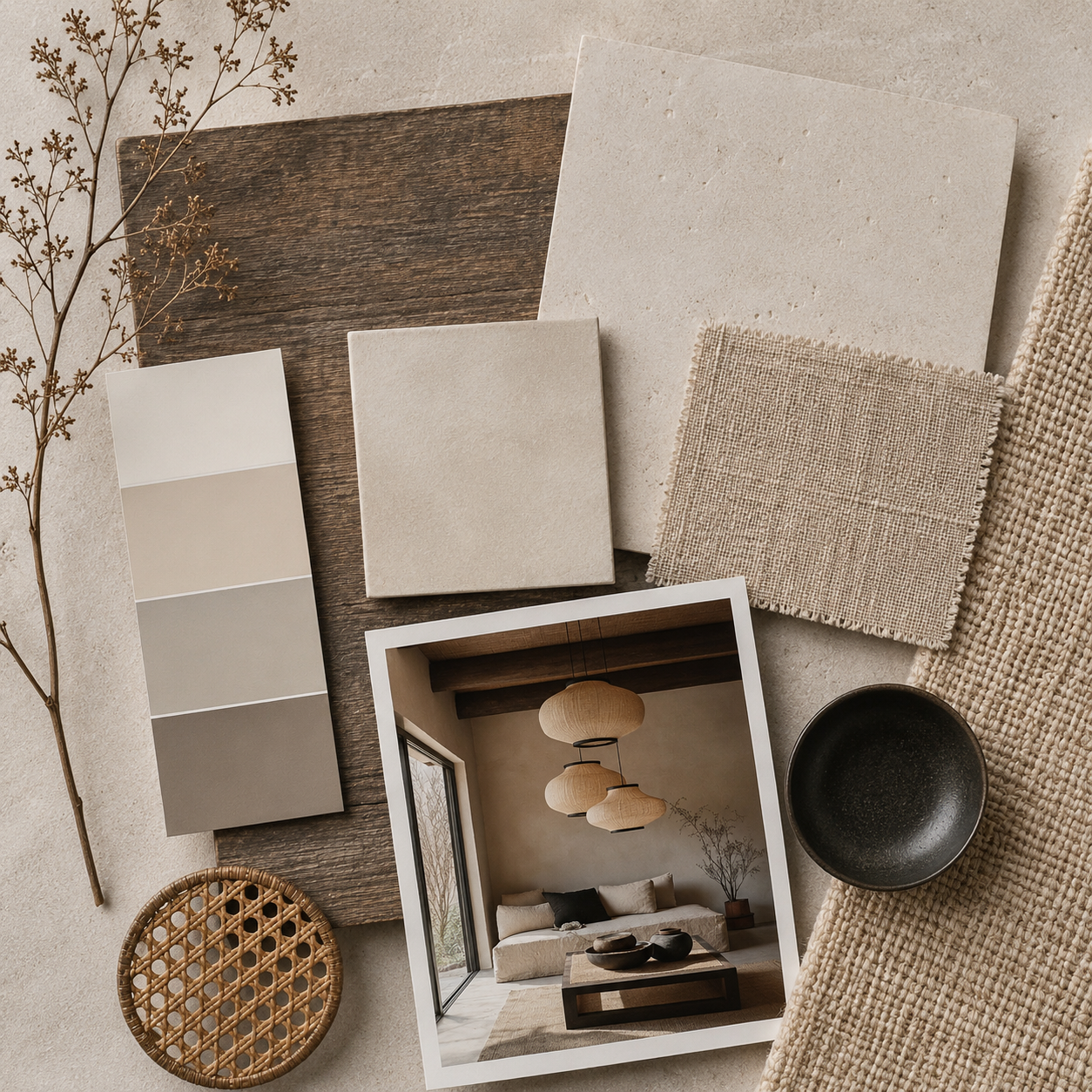
Warm Eucalyptus – Valspar

Valspar’s Warm Eucalyptus introduces a soft, earthy green that evokes renewal and serenity. The color draws inspiration from nature and vintage palettes, bridging past and present with its grounded, restorative tone.

How to Use It:
Ideal for bedrooms or bathrooms, Warm Eucalyptus enhances spaces dedicated to rest and self-care. Layer it with textured neutrals and natural fibers for a tranquil effect.
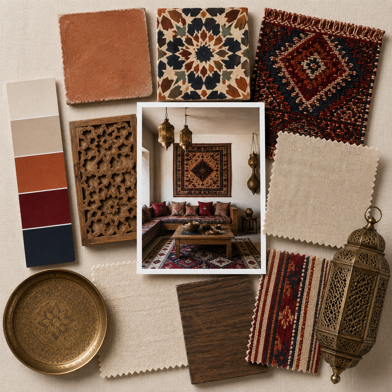
Warm Mahogany – Glidden

Glidden’s Warm Mahogany is a deep, inviting red-brown that speaks to intimacy and depth. It represents a shift toward richer, more expressive colors that create warmth and atmosphere.

How to Use It:
Perfect for dining rooms, libraries, and cozy living areas. Pair it with cream, taupe, or blush accents for a modern touch, or lean into its depth with brass, walnut, and velvet for a more dramatic setting.
Adventurer – Little Greene

Little Greene’s Adventurer is a regal plum tone that brings sophistication and a touch of mystery. This deep aubergine sits comfortably in the growing movement toward jewel tones that feel both luxurious and grounded.
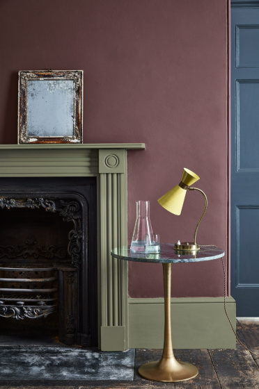
How to Use It:
Best in rooms where atmosphere matters—bedrooms, dining areas, or powder rooms. Pair with soft lighting and rich textures like silk, velvet, or aged bronze.
Divine Damson – Graham & Brown

Graham & Brown’s Divine Damson continues the moodier palette trend. It’s a deep plum with cherry undertones, adding instant drama and character to interiors.
How to Use It:
As a statement wall color or in smaller spaces such as hallways and home offices, this shade pairs well with muted metallics, dark wood, and soft neutrals.
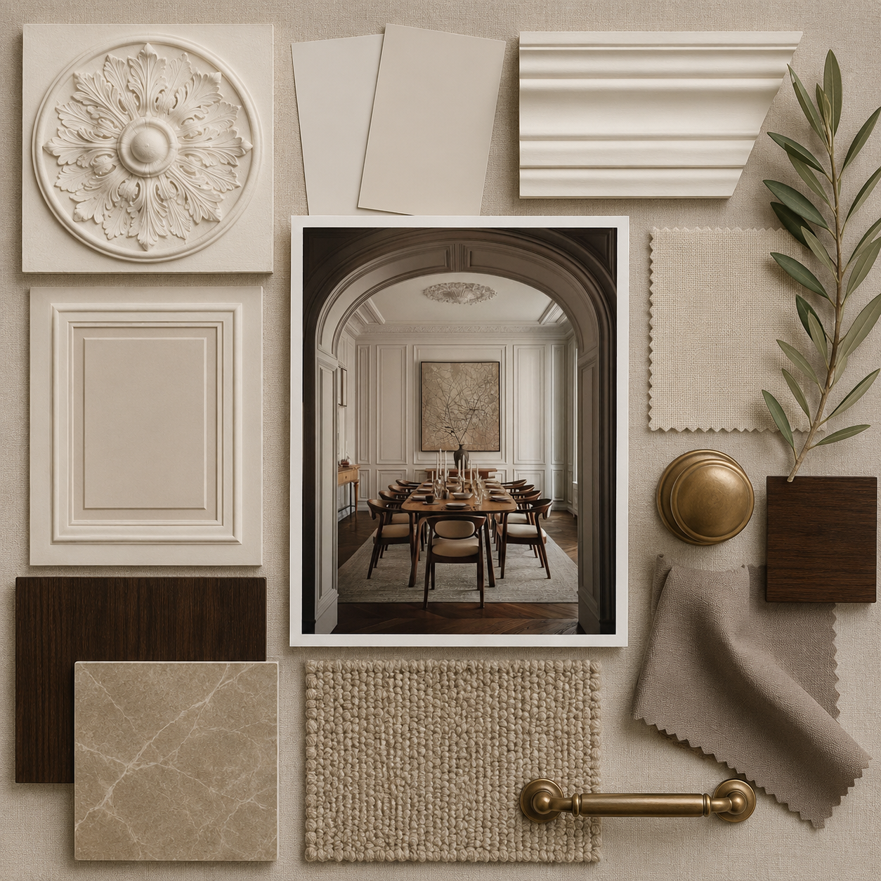
Melodious Ivory – Dutch Boy Paints

Dutch Boy’s Melodious Ivory is a warm, creamy beige with undertones of yellow and honey. It’s timeless, versatile, and designed to work across styles.

How to Use It:
As an all-over neutral in living rooms and kitchens, it creates a serene, connected environment. Combine it with handcrafted décor, natural fabrics, and light oak finishes for a balanced, lived-in feel.
Matte Coffee Bean – Krylon

Krylon’s Matte Coffee Bean embraces the return of dark neutrals. This rich brown celebrates craftsmanship, vintage furniture restoration, and the beauty of imperfection.
How to Use It:
Excellent for upcycled furniture projects or accent pieces. The matte finish gives it a modern industrial edge while maintaining warmth.
Epernay – C2 Paint

C2 Paint’s Epernay draws inspiration from European architecture and the soft golden light of champagne limestone. This refined, earthy ochre offers a sophisticated warmth that feels both classic and current.

How to Use It:
Perfect for entryways, studies, or kitchens where soft light enhances its golden undertones. Pair with stone textures or brass details for understated elegance.
How to Use 2026’s Color Trends at Home
Start Small
Test colors on accent walls, cabinetry, or furniture before committing to large-scale changes.
Work with Light
These colors shift dramatically throughout the day—always test them under natural and artificial lighting.
Balance Texture and Tone
Layer matte and textured finishes to give depth to neutral or dark shades.
Pair with Natural Materials
Complement these hues with organic surfaces such as stone, wood, rattan, and linen for a cohesive, grounded look.
Personalize the Palette
Mix and match shades that align with your own mood and identity. The 2026 palette is less about conformity and more about emotional connection.

The Takeaway
The 2026 Colors of the Year share a collective message: design is moving toward meaning.
Whether through the serenity of a soft neutral, the richness of a moody red, or the grounding calm of green, these hues reflect a deeper human desire for comfort, connection, and authenticity.
The year ahead invites us to embrace color not as decoration but as a reflection of how we want to feel—at home and within ourselves.
Explore more 2026 design trends and color trends on SampleBoard.com.