Last Updated on June 8, 2026 by Rosslyn Tebbutt
Table of Contents
Mood boarders and Pinterest junkies by heart, we love scouting trends and talking color, and today we have the pleasure of announcing yet another fascinating design craze in the making.
The comparison between the color Peach and Millennial Pink is interesting, as both colors have gained popularity in recent years for their soft, warm, and versatile qualities.
Millennial Pink, often described as a pale, muted pink with undertones of beige or peach, became a cultural phenomenon in the late 2010s.
It was embraced across various industries, including fashion, design, and branding, and it came to symbolize a shift away from traditional gender norms.
Conversely, the peach pink color is a specific color with a range of shades inspired by the fruit itself.
It is characterized by a warm, pale orange or pinkish-orange tone, often associated with feelings of sweetness, warmth, and approachability.

Comparing Peach Pink to Millennial Pink
Similar Aesthetic Appeal
Both Peach Pink and Millennial Pink share a soft and approachable aesthetic. They evoke warmth and tranquility, making them well-suited for various design applications.
Versatility in Design
Much like Millennial Pink, Peach is a versatile color that can be incorporated into various design elements, including fashion, interior design, and branding.
Evolution of Trends
Trends in color preferences can shift over time. While Millennial Pink had its moment in the spotlight, Peach might be seen as a continuation or evolution of the trend toward warm, comforting tones.
Gender-Neutral Appeal
Peach and Millennial Pink have been embraced for their gender-neutral qualities, challenging traditional color associations. They are often used in designs that appeal to a broad audience.
Cultural and Symbolic Associations
The symbolic associations of Peach and Millennial Pink may vary.
Millennial Pink was often associated with breaking down gender stereotypes, while Peach might evoke associations with warmth, friendliness, and approachability.
While Peach shares some similarities with Millennial Pink regarding aesthetic appeal and versatility, it is a distinct color with unique characteristics.
Peach Pink Colorways
Whether Peach becomes the “new” Millennial Pink depends on evolving design trends and cultural preferences.
Both colors, however, contribute to a broader trend of embracing softer, more inclusive, and gender-neutral tones in various design disciplines.
The past few years have been about Millennial Pink, and we’ve seen brilliant design solutions that pay tribute to this unbelievably eye-catching yet highly versatile shade.
Even the hardcore haters of pink had to think twice about how they felt about Millennial Pink, as designers indeed took the extra mile in breaking all the stereotypes built around this color.
Against all the odds and expectations, Millennial Pink reigned supreme for a long time and is still very much loved and played with by many.
So, what’s the catch, and where does Peach Pink fit into the picture?
Even though pastels are huge these days, you’ve probably noticed a general shift towards more mature and sophisticated color palettes.
The 70’s vibe is omnipresent and influences everything from furniture to fashion. Colors included!

psychology behind The Color Peach
Colors can profoundly impact human psychology and emotions; peach is no exception. Here are some psychological associations commonly attributed to the color peach:
Warmth and Comfort
Peach is often associated with warmth, evoking a sense of comfort and coziness. This makes it a popular home decor and fashion choice to create inviting and soothing atmospheres.
Friendliness and Approachability
The softness of peach makes it approachable, making it a friendly and inviting color. It can be used to create a positive and amicable impression.
Calmness and Tranquility
Peach has a calming effect on the mind and is often associated with tranquility. This makes it suitable for spaces where a sense of peace and relaxation is desired.
Femininity
Peach is sometimes associated with femininity, likely due to its proximity to shades of pink. It can convey softness and gentleness, making it a popular choice in women’s fashion and products.
Optimism and Positivity
The warm and optimistic undertones of peach can evoke feelings of positivity. It is a color often chosen to uplift moods and create a cheerful atmosphere.
Romance and Sensuality
Peach, a close relative of pink and a warm color, is sometimes associated with romance and sensuality. It can convey a soft and romantic ambiance.
Versatility and Adaptability
Peach is a versatile color that blends well with various other hues. Its adaptability complements a wide range of colors, making it a popular choice in design and fashion.
Youthfulness
The light and playful nature of peaches can convey a sense of youthfulness. Therefore, they are often chosen for designs targeting a youthful or modern audience.
Health and Wellness
Peaches are sometimes associated with health and wellness, particularly ripe fruits. This association can make them suitable choices for brands and spaces related to health and well-being.
Pantone’s Peachy Predictions
Yet another trendy color is not replacing Millennial Pink. It is growing up! And Peach Pink is in its next development phase.
Even though they both share a hint of orange in their presence, the color Peach embraces its punchiness and puts it on the forefront.
It is not as delicate and flashy as Millennial Pink and can be much more vibrant and powerful than pink could ever be.
We talked about Living Coral (Pantone color of the year 2019) on the blog a few years ago, and you will notice a strong resemblance between Pantone’s latest Color of the Year for 2024, “Peach Fuzz,” and Living Coral.
We’ve made some general comparisons based on the characteristics of the two colors.
Pantone Color of the Year 2019: Living Coral
Living Coral is a vibrant, warm coral hue with golden undertones.
It was chosen for its lively and energetic qualities, symbolizing the fusion of modern life with the natural world. Living Coral evokes a sense of optimism, joy, and connection to nature.
General Characteristics of Living Coral:
- Vibrant and energetic.
- Warm with golden undertones.
- Evokes a connection to nature.
- Symbolizes optimism and joy.
- Versatile and used across various design disciplines.
Pantone Color of the Year 2024: Peach Fuzz
Potential General Characteristics of Peach Fuzz (Hypothetical):
- Soft and inviting.
- Warm and gentle.
- Symbolizes comfort and tranquility.
- Versatile for use in various design applications.
- It could convey a sense of kindness and connection.

Peach smells like late Spring or early Summer. It can be very adolescent and romantic—like a kiss on the cheek or a warm hug.
It suggests rebellion and life, but not in a destructive way, but rather in a curious and utopian way. It is sexy, ethereal, and fun. It is the new Millennial Pink!
When it comes to mixing and matching, Peach is so peachy (sorry for the cheese line, guys, but I couldn’t help myself).
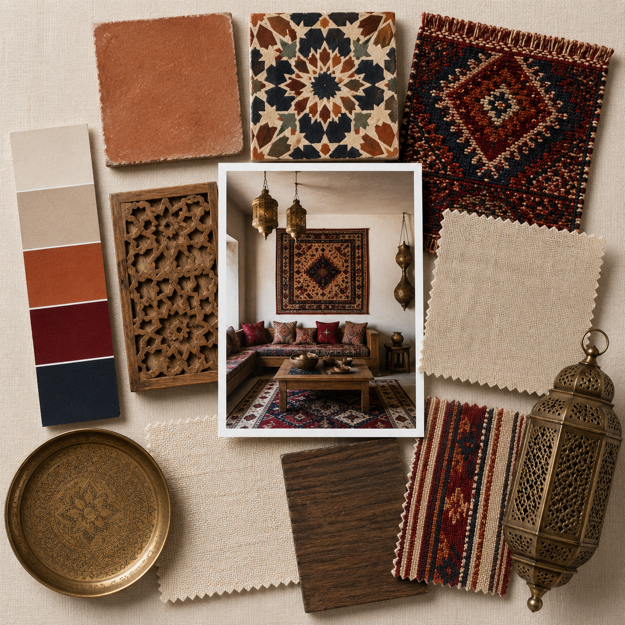
You can pair it with greys and whites (like we did in this inspiration board) or with yellows, greens, blush, red, dusty blue, teal, or beige.

When it comes to metals, your best bets are gold and brass (super trendy at the moment), as they pop so elegantly when placed next to Peach.
Under the right circumstances, peach pink can be used as an accent color and a neutral shade. However, it is an attention hog, so you must tone it down briefly.
Gold and brass can help with this, as can wood and natural textiles.
Let us know what you think about this color trend. Is it your cup of tea, and do you see it becoming huge in the coming months?
We ended up with some peachy interiors that caught our eye!
Enjoy!

image source: Critical Babe

image credit: Blake Pope

design: Jessica Helgerson Interior Design / photo: Aaron Leitz / source: YellowTrace

retail store: Red Valentino

render by Alexis Christodoulou

image credit: Enter My Attic

image source: Homedit

design: Tribe Studio / photo: Katherine Lu