Last Updated on June 8, 2026 by Rosslyn Tebbutt
We’ve been waiting and anticipating, and finally – it’s been revealed!
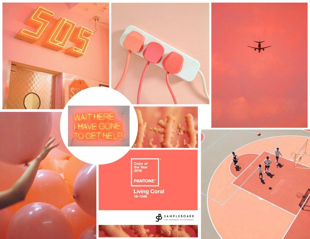
According to the Pantone Color Institute, the world’s leading expert on color (at least in terms of hype), the color of the year 2019 will be Living Coral!
Move away Ultra Violet, we have a new favorite to play with, and don’t worry – we promise you won’t be missed!
As we are already used to, Pantone’s choice for 2019 is bold and eye-catching and utterly opposite to its predecessor.
The early reactions of the interior design industry authorities have been more or less positive so far.
For the first time in three years, they forecast a bright future in the field of interior design for Pantone’s favorite.

Living Coral as a Symbol
But let’s clarify from the start – the lines below will not be a trend talk with matchy-matchy tips for coordinating decor and accessories in the hottest shade of the year.
Pantone color predictions have become much more than just predictions about what shade will be trending in the seasons ahead.
For the past eighteen years, Pantone has traveled the world, analyzing cultural and societal trends and gathering insights to form a bigger picture of the world.
Eighteen years is a looot of data!
Laurie Pressman, Vice President of the Pantone Color Institute, points out:
“(Pantone Color of the Year) is a color snapshot symbolic of what’s taking place in the culture at a moment in time.“ But last year, she went even further:
“The Pantone Color of the Year has come to mean so much more than ‘what’s trending’ in the world of design; it’s truly a reflection of what’s needed today.”
Since their mission has grown from just analyzing trends to forming them and offering solutions, discussing Living Coral as Pantone color of the year for 2019 would only make sense if we reflect on the story they delivered to back up their choice.
What does Living Coral stand for?
Described as: An animating and life-affirming coral hue with a golden undertone that energizes and enlivens with a softer edge, Living Coral marries the best of two worlds – pastels and neons.
Like in many great marriages, it’s not easy to pinpoint where one stops and the other begins, but this is also true for almost everything about this bold shade.
Living Coral is somewhere between pink and orange, sweet and toxic, playful and dangerous, optimistic and apocalyptic. It is truly somewhere in between and allows for a range of different interpretations.
Depending on the context, Living Coral can feel warm and mellow, reassuring and comforting. It can be uplifting and inspiring, or even childish at times.
It reminds us of desert sandstones, adobe dwellings, and tropical sunsets.
“Living Coral emits the desired, familiar, and energizing aspects of color found in nature. (…) Sociable and spirited, the engaging nature of PANTONE 16-1546 Living Coral welcomes and encourages lighthearted activity.
Symbolizing our innate need for optimism and joyful pursuits, PANTONE 16-1546 Living Coral embodies our desire for playful expression,” stands in Pantone’s press release.

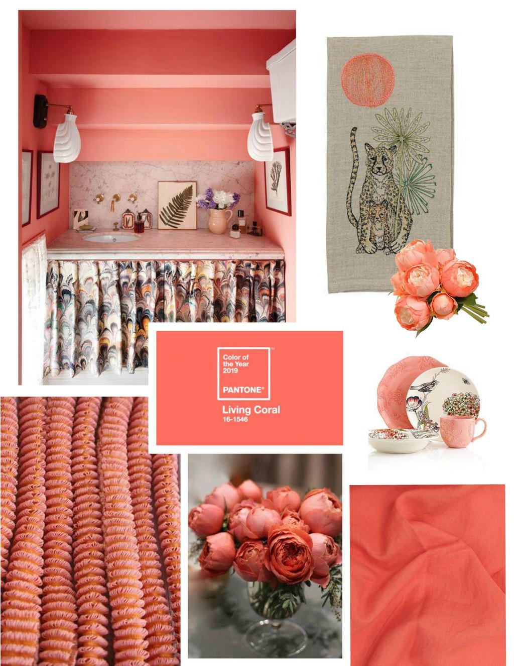
Shop the pieces in Pantone Living Coral from this mood board at Italian Bark
But Living Coral can also be warning, electric, distant, highly digital, and difficult to chew. Leatrice Eiseman, Executive Director of the Pantone Color Institute, offers an explanation for this side too:
“Representing the fusion of modern life, PANTONE Living Coral is a nurturing color that appears in our natural surroundings and at the same time, displays a lively presence within social media.”
Pantone continues:
“With consumers craving human interaction and social connection, the humanizing and heartening qualities displayed by the convivial Pantone Living Coral hit a responsive chord. (…) As we continue to seek immersive experiences that offer intimacy and genuine connection, Living Coral symbolizes our innate need for optimism and joyful, lighthearted pursuits.”
Year after year, Pantone points out the feeling of disconnection brought about by the digital society.
We desperately crave optimism (Greenery, Ultra Violet, Living Coral), approval (Rose Quartz), and now intimacy (Living Coral).
Being constantly connected via social media, we actually nurture a growing need for intimacy within ourselves, with each other, and with Nature.
Having in mind the vast amount of data Pantone has at its disposal, should we be worried?
Why Living Coral?
With all the political, economic, environmental, and social crises that hit the world in the past couple of years, we seek psychological shelters where we can unwind, regroup, and simply feel good.
Warm, natural, and strong, Living Coral is supposed to bring just that:
“Lying at the center of our naturally vivid and chromatic ecosystem, PANTONE Living Coral is evocative of how coral reefs provide shelter to a diverse kaleidoscope of color.”
Pantone’s cryptic remarks might be dressed in beautiful wishful thinking, but this year, to be honest, I find them dark and morbid.
In times when real corals who provide shelter to marine life, are rapidly disappearing and are being washed away of their signature colors, naming a color of the year as Living Coral and saying that it stands for optimism and life doesn’t sound right.
But I am not the only one who feels this way.
Yet, according to Pantone’s research, a majority of people see sunsets and a warm hug in them. Perhaps I would be on the same team if it wasn’t for the context.
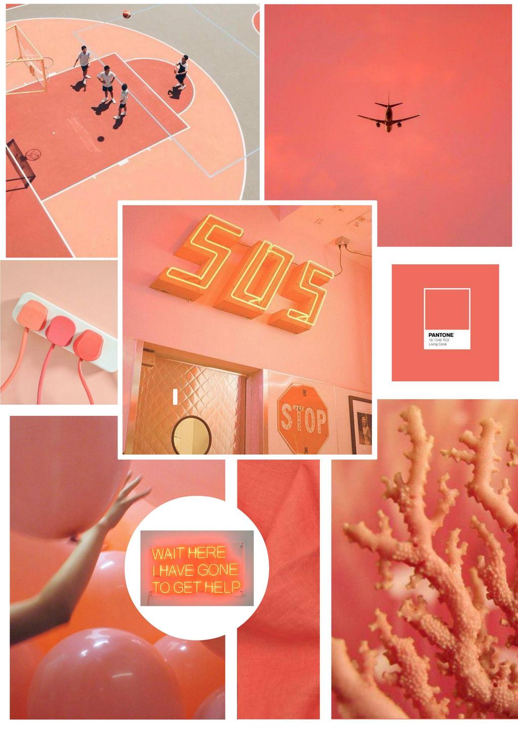
Pantone 16-1546 Living Coral
Pantone describes Living Coral as a vibrant and warm coral hue with golden undertones. The selection of Living Coral was influenced by the increasing impact of digital technology on daily life and the desire for authentic and immersive experiences.
Here are some key aspects and associations related to Living Coral:
Vibrancy and Energy:
- Living Coral is a lively and energetic color that draws attention. Its vibrancy reflects a dynamic and spirited quality.
Connection to Nature:
- The color was chosen to symbolize the intersection of modern life and the natural world. Living Coral evokes images of coral reefs and marine life, emphasizing the importance of environmental conservation.
Optimism and Joy:
- Living Coral was selected to convey a sense of optimism, joy, and playful expression. The warm and inviting nature of the color was intended to inspire positivity.
Social Connection:
- Living Coral is a sociable and engaging color. Pantone emphasized its role in fostering connections, representing the importance of human interaction and shared experiences.
Versatility in Design:
- Living Coral is a versatile color that can be applied across various design disciplines, including fashion, interior design, graphic design, and product design.
Gender-Neutral Appeal:
- The color was chosen to be gender-neutral, challenging traditional color associations. This inclusivity aimed to appeal to a broad audience.
Fashion and Lifestyle Influence:
- Living Coral had a significant impact on fashion and lifestyle trends in 2019. It was featured in clothing, accessories, beauty products, and home decor items.
Environmental Awareness:
- The selection of Living Coral also served as a reminder of coral reefs’ vulnerability and the need for environmental conservation efforts.
Pantone’s Color of the Year often influences design and aesthetic trends across various industries.
Living Coral’s blend of warmth, energy, and environmental consciousness left a lasting impression on the design landscape in 2019.
Color Talk
Neon, orange, red, and yellow… are all on trend already. But at the moment, they are mostly earthy and muted, with occasional pastel pops.
Cavern Clay, Sherwin Williams’ color of the year for 2019, is a great example of this natural, retro look. But saturated, dramatic colors are gaining momentum, and Pantone saw it.
In an interview with Apartment Therapy, Emily Henderson came up with a beautiful description for the shade:
“2017’s Millennial Pink had a love child with 2018’s Terra Cotta, and it is the new Pantone color of the year – Living Coral.”
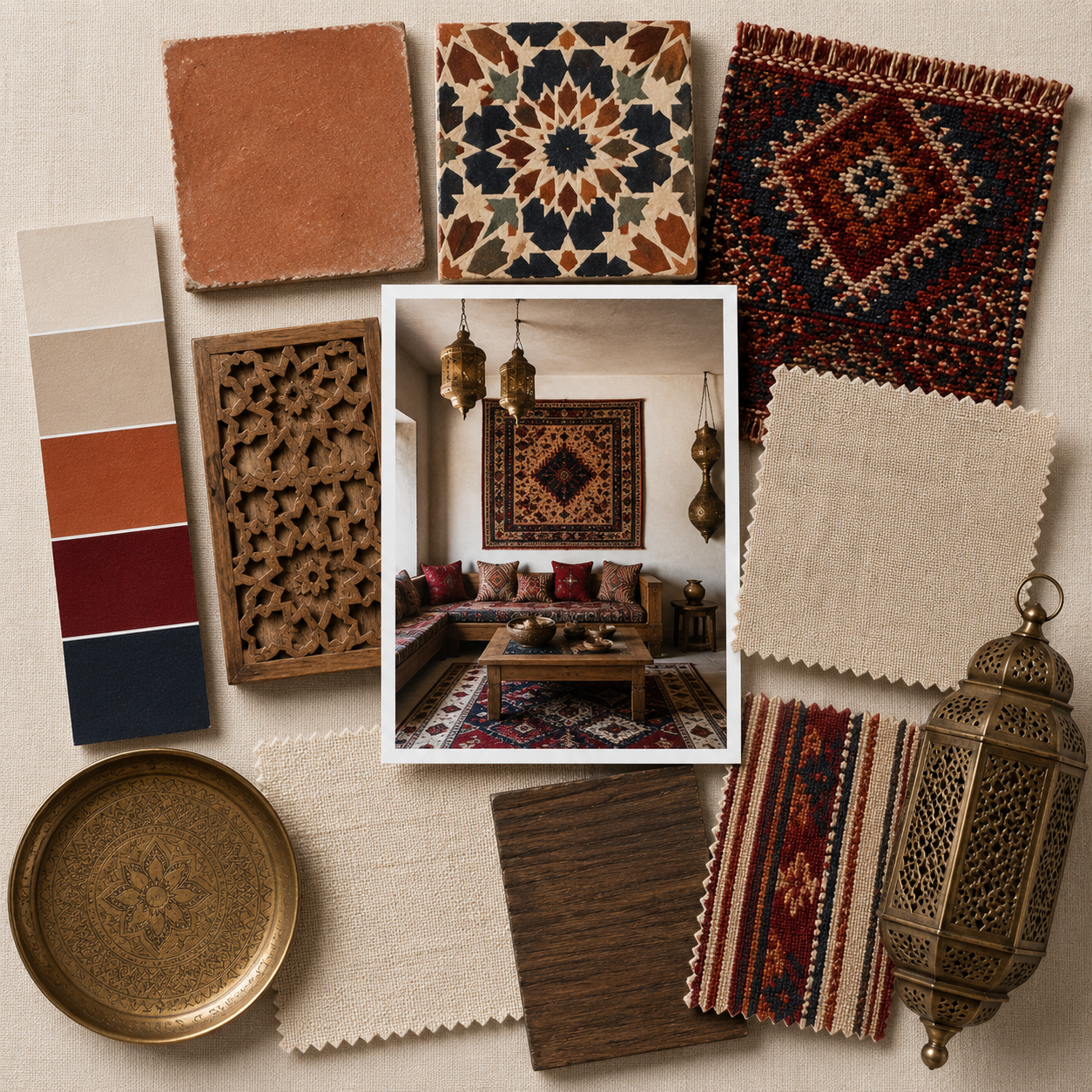
Living Coral is a team player. It’s gender-neutral and very inclusive. It goes pretty much with everything: teal, camel, navy blue, grey, off-white, green, gold… It looks beautiful in rich textures and is definitely smoking hot, like velvet.
It can be used in pops or as a dominant color. In interior design, pops will be preferred since an all-coral look can be a bit difficult to pull off without creating an overbearing statement. However, it is not impossible.
Even though we don’t find its symbolics very appealing, we cannot but feel fondly about Living Coral.
We, too, believe the Pantone color of the year for 2019 will be loved by interior designers around the world, and we look forward to seeing how you will implement it in your mood boards.


Best Board of January 2019 at SampleBoard – created by Melanie Revell