Last Updated on June 8, 2026 by Rosslyn Tebbutt
Sunset ochre is set to become one of the most expressive and uplifting colors of 2026.
Inspired by the golden hours of dusk, this warm yellow-orange tone brings emotional vibrancy, depth, and natural radiance into modern interiors.
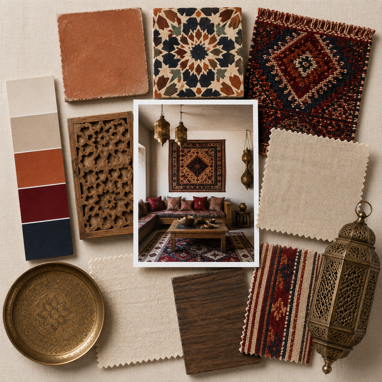
These warm tones are central to Southwestern interiors, where terracotta, clay, and wood create depth and warmth.
- The Emotional Impact of Sunset Ochre
- A Material-Driven Color With Global Roots
- Where Sunset Ochre Fits in Modern Design Styles
- How to Use Sunset Ochre Successfully
- Sunset Ochre in Different Rooms: Transformative Effects
- 2026 SampleBoard Forecast: Sunset Ochre Palettes
- Styling Sunset Ochre: Texture, Layering, and Warm Neutrals
- Understanding Ochre Undertones: What to Choose
- The Cultural and Design Significance of Sunset Ochre in 2026
- Why Sunset Ochre Will Continue Into 2027

As design continues shifting away from cool minimalism and toward warmer, more character-rich palettes, sunset ochre stands out for its ability to energize and comfort at the same time. It feels earthy yet optimistic, bold yet livable, grounding yet joyful.
Sunset ochre introduces a new era of color confidence—one where interiors feel sun-washed, human, and full of personality. From soft ochre washes to deep sunset-saffron paint, the shade is set to shape both residential and commercial spaces in 2026.

The Emotional Impact of Sunset Ochre
Color psychology plays a central role in why sunset ochre is gaining traction. The shade embodies warmth, creativity, optimism, and emotional uplift.
It mimics the colors found in nature during late-afternoon light—moments associated with calm, reflection, and beauty. In an increasingly fast-paced world, sunset ochre provides a sense of grounding warmth without the heaviness of browns or the intensity of bright yellows.
It feels tactile and comforting, evoking memories of clay pottery, sun-baked landscapes, glowing sunsets, and ancient pigments.
As emotional design trends deepen in 2026, sunset ochre becomes a natural choice for creating spaces that feel nurturing and restorative while still expressing personality.


A Material-Driven Color With Global Roots
Sunset ochre has roots in natural pigments that have been used across cultures for centuries.
Earthen ochres, clay pigments, saffron dyes, iron oxide powders, and mineral-rich soils bring this warm tone to life. In 2026, designers are expressing sunset ochre not just through paint, but through textured and authentic materials.
Expect ochre microcement walls, artisan plaster finishes, clay-based paints, earthenware ceramics, sun-washed textiles, glazed terracotta tiles, and naturally dyed fabrics. Velvet, linen, wool, and jute all absorb ochre tones beautifully, creating rich, tactile environments.
When used through materials rather than only color, sunset ochre feels grounded, sensory, and connected to heritage craftsmanship.

Where Sunset Ochre Fits in Modern Design Styles
Sunset ochre is highly adaptable across multiple design aesthetics.
In Mediterranean-inspired spaces, it feels natural and sun-soaked. In minimal and Scandinavian interiors, it adds a subtle warmth that softens pale woods and clean lines.
In bohemian and eclectic spaces, ochre radiates character and global influence. In contemporary urban interiors, it introduces a modern earthiness that pairs well with charcoal, blackened steel, and textured neutrals.
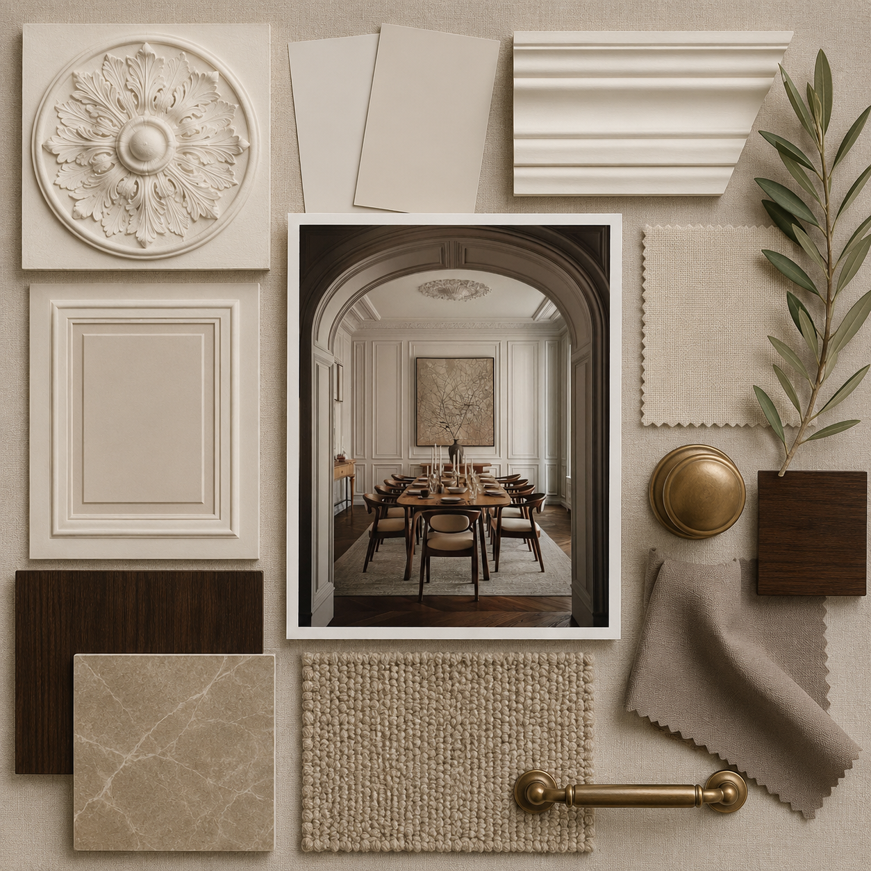
In heritage or classic interiors, ochre echoes traditional pigments found in old-world architecture. Because of its broad versatility, sunset ochre seamlessly integrates into any design style that values warmth, natural texture, and emotional depth.

How to Use Sunset Ochre Successfully
Sunset ochre is expressive, so using it with intention helps create balance. Soft ochre tones work beautifully on large surfaces like walls or ceilings, especially in matte or plaster finishes that diffuse light elegantly.
Deeper sunset hues shine in feature walls, accent corners, built-in shelving, or statement furniture pieces. This color will also work for color capping.
Ochre pairs exceptionally well with warm lighting—amber bulbs, brass sconces, and soft-glow pendants enhance its radiance.
If used in smaller rooms, consider pairing ochre with neutrals and natural textures to maintain airiness. In larger spaces, ochre can be layered tonally with rusts, siennas, browns, and terracotta to create a warm, enveloped environment.
Avoid pairing with cool-toned whites, which can create contrast that feels sharp and unbalanced. Instead, use cream, oatmeal, sand, and bone tones to complement ochre’s warmth.

Sunset Ochre in Different Rooms: Transformative Effects
Each room responds differently to sunset ochre. In living rooms, it adds inviting warmth and creates a relaxed, grounded atmosphere—especially when paired with natural timber and soft neutral furniture.
Bedrooms benefit from softer ochre tones that feel cozy and cocooning, ideal for creating a restful environment.
Dining rooms take on an elevated, almost golden-hour glow when drenched in sunset ochre, enhancing ambience and visual warmth during gatherings.
Kitchens look striking with ochre cabinetry or splashbacks, especially when paired with brass or walnut. In bathrooms, sunset ochre microcement or stone-look tiles create a spa-like, earthen retreat.
Entryways drenched in ochre feel welcoming, radiant, and full of character—making a memorable first impression.


2026 SampleBoard Forecast: Sunset Ochre Palettes
Sunset ochre shifts depending on undertone, and the following palettes are forecasted to dominate in 2026.
Golden Terrain — Sunset ochre, warm charcoal, oatmeal, raw timber, and natural stone. A refined, contemporary palette with grounded warmth.
Saffron Clay — Deep saffron, rust tones, terracotta, and off-white ceramics for Mediterranean and desert-inspired homes.
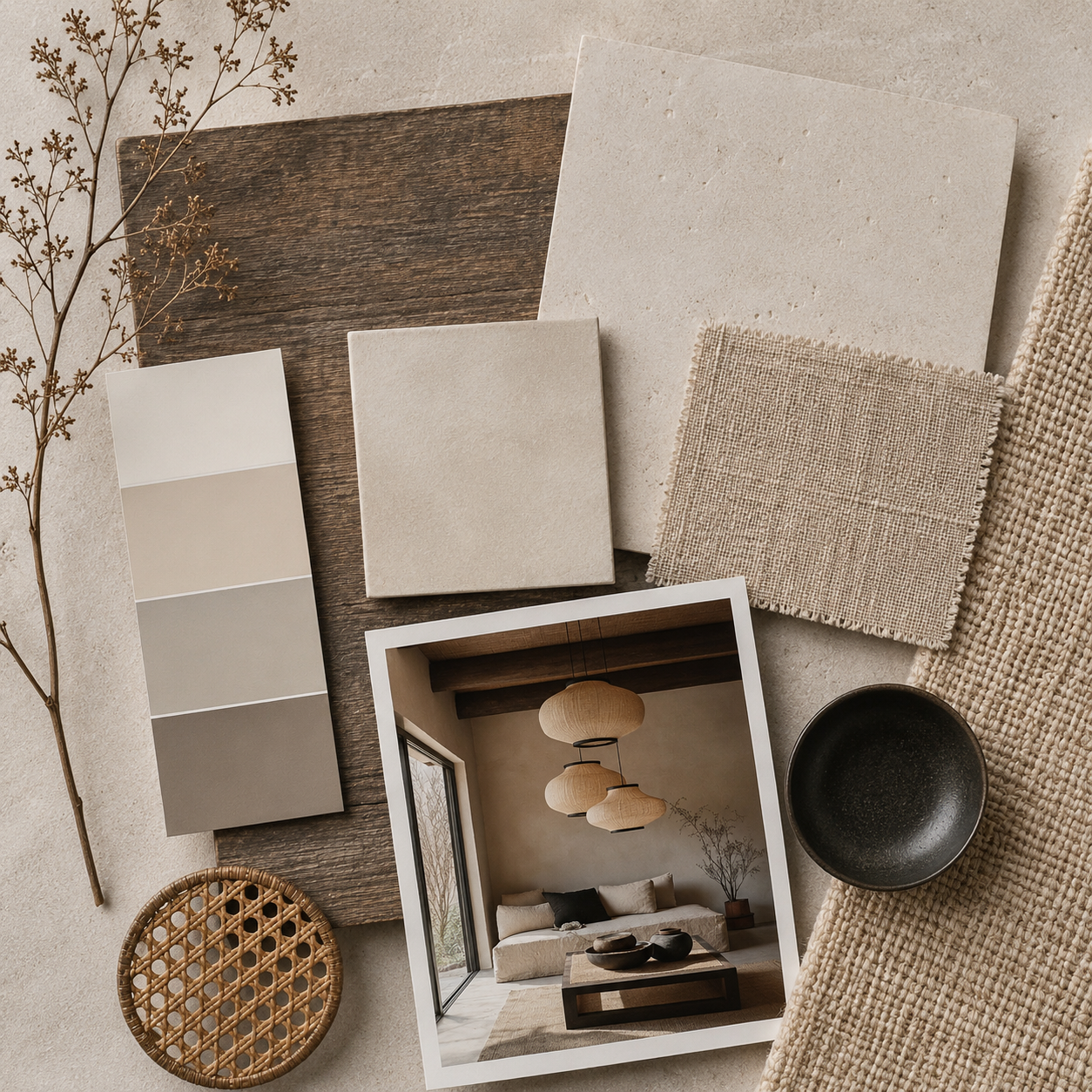
Glow Minimalism — Soft-washed ochre, bone neutrals, pale oak, and linen textures for Scandinavian and Japandi-style spaces.
Modern Boho Sunset — Burnt ochre, warm pinks, woven fibers, walnut accents, and patterned textiles for global, handcrafted interiors.
Oasis Earth — Ochre, olive green, clay red, travertine, and natural wool—an earthy, biophilic palette connecting to nature.
Each palette highlights the versatility of sunset ochre and its ability to shift from soft and muted to bold and dramatic.


Styling Sunset Ochre: Texture, Layering, and Warm Neutrals
Styling with sunset ochre is all about embracing warm, tactile materials that echo the hue’s natural roots. Soft linens, boucle, wool blankets, rattan, cane, and raw oak pair beautifully with ochre’s warmth.
Brass, copper, antique gold, and bronze enhance ochre tones without overpowering them, while stone and ceramics bring grounding structure. Keep accessories minimal to let the color shine.
Abstract art in warm neutrals, earthy ceramics, handmade pottery, sculptural pieces, and woven wall decor all complement sunset ochre’s organic feel.
Because the color is expressive, styling should lean toward calm textures and intentional pieces that balance the room.

Understanding Ochre Undertones: What to Choose
Choosing the right shade of ochre depends on lighting and the desired atmosphere.
Yellow-based ochres feel sunny, bright, and energetic—best for rooms with plenty of natural light. Orange-based ochres feel warm and grounded—ideal for cozy interiors and Mediterranean-inspired spaces.
Brown-based ochres feel rich, sophisticated, and muted—perfect for contemporary or luxury environments.
Soft, pastel ochres add a gentle glow to minimal and Scandinavian designs. Deep, sunset-inspired hues create impact in feature spaces or when used for color drenching.
Evaluate the room’s natural and artificial lighting to determine how the undertone will shift throughout the day.
The Cultural and Design Significance of Sunset Ochre in 2026
Sunset ochre resonates deeply with global design trends rooted in nature, wellbeing, craft, and emotion.
In an age where people seek spaces that feel warm, meaningful, and connected to the outdoors, ochre serves as a symbolic link to natural cycles, sunlight, and earthy materials.
The color reflects broader cultural shifts toward slow living, heritage craftsmanship, and global-inspired design. It captures both nostalgia and modernity—echoing ancient pigments while feeling fresh and forward-thinking.
As sustainability becomes more central to design, ochre’s connection to natural materials and pigments makes it even more relevant for the years ahead.

Why Sunset Ochre Will Continue Into 2027
Sunset ochre has staying power because it embodies timeless warmth and earthiness that do not rely on short-lived trends.
As cooler palettes fade and designers embrace richer, more soulful colors, ochre emerges as a key companion to new neutrals and earthy tones. Its emotional resonance—comfort, joy, warmth, and grounding—ensures that it will remain desirable well beyond 2026.
The color harmonizes beautifully with long-term trends like biophilic design, artisan craftsmanship, textural interiors, and sensory-driven spaces.
Because it is both bold and livable, sunset ochre will continue influencing paint collections, textiles, furnishings, and architectural finishes into 2027 and beyond.