Last Updated on March 27, 2026 by Rosslyn Tebbutt
Color trends for 2026 reflect one overwhelming truth: people no longer want interiors that simply look beautiful — they want spaces that feel soothing, stable, optimistic, and emotionally intelligent.
Color has become a wellbeing tool, a nervous-system regulator, and a quiet form of self-care.
And in 2026, palettes evolve into two dominant directions that might seem opposite, but actually reflect the complexity of our times: Emotional Neutrals and Nature-Tech hybrids.
- Why Color Is Changing in 2026
- Trend 1: Emotional Neutrals — The New Language of Calm
- Trend 2: Nature-Tech Palettes — Where Digital Softness Meets Earth Pigments
- How These Two Palettes Work Together
- Material Trends Shaping 2026 Color Forecasting
- Conclusion: 2026 Color Is Emotional, Sensory & Future-Focused
This movement goes beyond surface styling. It emerges from cultural, emotional, and environmental shifts shaping how we live.
At SampleBoard, we see these movements reflected across major CMF launches, material fairs, interior trend exhibitions, and global design conversations.
Sensory color is no longer a trend — it is the new framework guiding interior design futures.


Why Color Is Changing in 2026
Several global changes are reshaping color preferences and emotional responses.
1. Emotional fatigue & the need for calm
People feel overstimulated — visually, digitally, socially. Interiors are shifting toward colors that restore balance, regulate nervous systems, and support daily wellbeing.
2. The rise of sensory wellness
Neurodivergence awareness, trauma-informed design, and sensory-inclusive environments are influencing designers to choose low-saturation, mid-tone, grounding colors.
3. Climate-driven aesthetics
Natural pigments and mineral tones are becoming mainstream as sustainability becomes a design ethos. Earth-derived color carries trust, timelessness, and authenticity.
4. Digital aesthetics influencing real spaces
AI-generated imagery, vapor pastels, surreal gradients, and softened digital palettes are influencing how designers rethink color in physical interiors.
5. Material-led color forecasting
As CMF strategies evolve, color harmonies arise from materials themselves — clay, linen, cork, wool, plaster, bio-resins, algae pigments, and natural inks.
Together, these shifts shape a color landscape that is sensorial, grounding, and emotionally intelligent, yet subtly futuristic.


Trend 1: Emotional Neutrals — The New Language of Calm
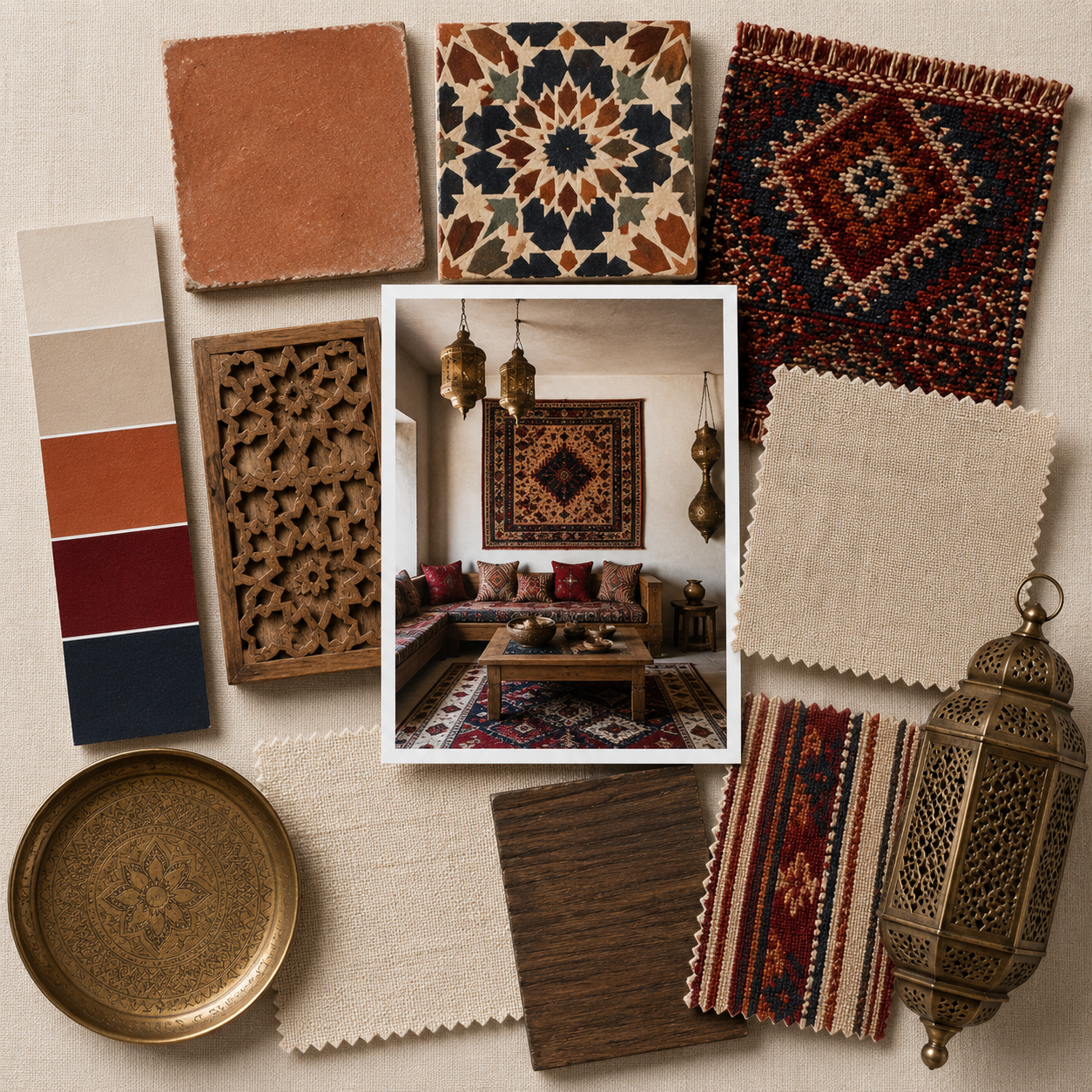
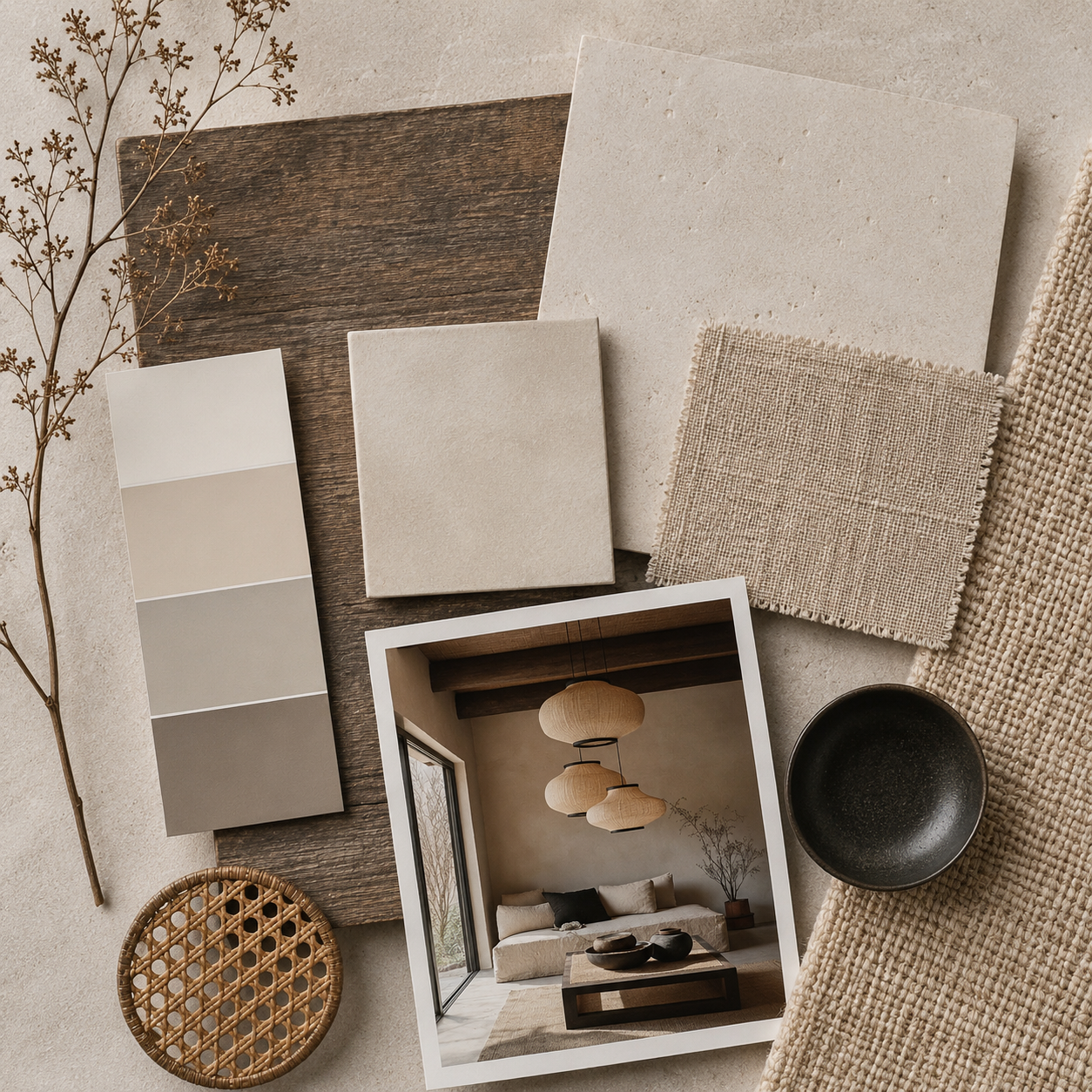
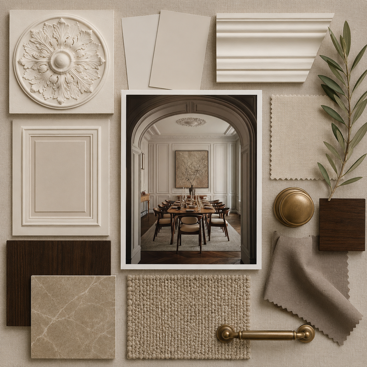
Emotional Neutrals are the foundational palette for 2026. These neutrals are not cold, muted greys — they are warm, skin-tinted, mineral-infused tones inspired by clay, oat milk, mushroom fiber, and soft daylight.
Their purpose is not decorative. Their purpose is regulation.
2026 Emotional Neutrals Include:
Oat Cream
A warm, milky neutral that softens any space and enhances natural textures.
Soft Clay
A pink-tinted beige inspired by terracotta and earth pigments.
Mushroom Taupe
A grounding grey-brown rooted in natural softness and sensory warmth.
Warm Fog
A warm-grey tone that reduces visual noise and supports calming interiors.
Pebble Sand
A textured beige reminiscent of river stones, dunes, and sun-lit sand.
Why Emotional Neutrals Are Dominating 2026
They reduce visual clutter and cognitive load — essential in overstimulated lives.
They harmonize with natural materials such as plaster, cork, wool, and linen.
They support wellness-based interiors, creating safe, quiet environments.
They photograph beautifully, aligning with soft minimalism trends.
They aid neuroinclusive design by avoiding sharp contrasts and high saturation.
Emotional Neutrals will define residential design, hospitality spaces, wellness studios, retail environments, and furniture finishes throughout 2026.
These emotional neutrals are central to organic modern interiors, where color is used not for contrast, but for atmosphere—layering warm beiges, soft browns, muted greens, and clay tones to create spaces that feel grounded, calm, and deeply connected to nature.
Explore the Organic Modern Interior Design Style Guide →


Trend 2: Nature-Tech Palettes — Where Digital Softness Meets Earth Pigments
The Nature-Tech palette represents the second major direction for 2026 interior color trends — a fusion of natural tones and soft, digital-inspired color. This palette reflects the tension and harmony between ecological grounding and technological acceleration.
2026 Nature-Tech Colors Include:
Botanical Green
A chlorophyll-rich green symbolizing regeneration, biology, and biophilic intelligence.
Digital Lilac
A soft, ethereal purple influenced by AI visuals and future-leaning digital palettes.
Ocean Slate
A deep blue-green inspired by minerals, coastline shadows, and underwater stone.
Hyper-Olive
A future-forward olive with subtle neon undertones — nature meets circuitry.
Cloud Mint
A cool pastel with a surreal softness, bridging wellness with futurism.
Why Nature-Tech Is Rising
Digital culture is becoming softer and more emotionally intelligent, influencing how designers think about color.
Designers want to merge ecological awareness with future aesthetics.
Younger generations gravitate toward hybrid palettes — part natural, part digital.
Wellness interiors are evolving into “bio-futurist” spaces where nature and innovation coexist.
Nature-Tech colors feel refreshing yet grounded, futuristic yet familiar — ideal for interior design sectors exploring the intersection of sustainability and technology.

How These Two Palettes Work Together
While Emotional Neutrals bring grounding and safety, Nature-Tech accents bring movement, mood, and innovation. Together, they create a layered palette ideal for 2026 interiors.
A warm neutral living room combined with mint accents, botanical ceramics, or digital lilac artwork feels calming yet contemporary — earthy yet future-oriented.
The harmony between these palettes reflects the balance people seek in modern life: stability with curiosity, calmness with optimism.

Material Trends Shaping 2026 Color Forecasting
Color evolves alongside materials. For 2026, material trends strongly reinforce both palettes.
- Limewash and clay paint introduce soft, cloudy neutrals.
- Cork and mushroom mycelium drive warm organic browns.
- Wool, boucle, and felt bring tactile neutrals and mossy greens.
- Bio-resins, translucent composites, and recycled plastics add digital pastels.
- Oxidized metals introduce mineral blues and greens.
These materials blur the lines between color and texture, creating palettes that are deeply sensorial and materially informed.


Conclusion: 2026 Color Is Emotional, Sensory & Future-Focused
The 2026 color landscape is shaped by a universal emotional need for grounding, restoration, and stability — paired with a hopeful curiosity for the future.
Emotional Neutrals create safety and softness, while Nature-Tech accents create freshness and innovation. Together, they offer a complete palette for the next era of interior design: warm, sensorial, regenerative, and quietly futuristic.
SampleBoard’s 2026 color forecast positions color not just as a trend but as an essential design tool for wellbeing, connection, and future-facing interiors.