Last Updated on May 25, 2026 by Rosslyn Tebbutt
Color drenching is one of the most influential design movements shaping interiors for 2026. Instead of using color selectively on a single feature wall, this technique saturates an entire room in a single hue.
Walls, ceilings, doors, trims, cabinetry, built-ins, and even soft furnishings become part of one unified color envelope.
- Why Blue Leads the 2026 Color Drenching Movement
- The Psychology of Blue and Why It Matters in 2026
- Beyond Paint: Blue as a Material Story
- How to Successfully Color Drench with Blue
- Blue in Different Rooms: Where the Trend Works Best
- 2026 SampleBoard Forecast: Blue Palettes to Watch
- How to Style a Blue-Drenched Space
- Choosing the Right Blue: Undertone Guide
- Why This Trend Will Continue Into 2027
For designers presenting immersive, color-drenched interiors, the Margeaux Design Presentation and Mood Board Templates from SampleBoard Studio offers a refined way to showcase tonal depth, layered blues, and mood-driven spatial concepts.

The result is a space that feels immersive, intentional, and deeply atmospheric. Unlike traditional painted rooms, color-drenched spaces remove visual interruptions, allowing form and texture to stand out while the color becomes the backdrop and the main character simultaneously.
While many hues can be used for this look, blue has emerged as the standout shade leading the trend.

Why Blue Leads the 2026 Color Drenching Movement
Blue is an incredibly versatile hue, making it ideal for full-room saturation. It is timeless yet contemporary, calming yet expressive, and works across a wide range of design styles.
In 2026, designers are embracing blue for its ability to create serene, cocoon-like environments that still feel sophisticated and elevated.
Blue’s emotional range is unmatched: it can be airy and delicate, stormy and dramatic, or rich and luxurious.
Because it sits comfortably between classic and modern, blue supports everything from coastal and Scandinavian interiors to contemporary urban spaces and heritage-inspired rooms.
Its adaptability means color drenching with blue never feels overwhelming—it feels intentional.

The Psychology of Blue and Why It Matters in 2026
As global design shifts further toward emotional well-being, color psychology plays a major role in how homes evolve. Blue has long been associated with clarity, calm, trust, cooling balance, and stability.
In a post-2025 world defined by pressure, overstimulation, and digital overload, people seek interiors that help them slow down and breathe. Full-saturation blue environments deliver exactly that.
Blue reduces mental noise, offers visual rest, and creates a feeling of safety and enclosure without heaviness. When drenched across a room, blue acts almost like a sensory filter—softening hard edges, quieting busy details, and creating a sanctuary-like effect.
This aligns perfectly with 2026’s focus on restorative design, sensory homes, and spaces that enhance emotional wellness.

Beyond Paint: Blue as a Material Story
Color drenching is more than simply painting a room in a single shade. It is about extending that hue through materials, finishes, and textures to create a cohesive visual rhythm.
Blue’s material versatility is one of the reasons it’s dominating the trend.
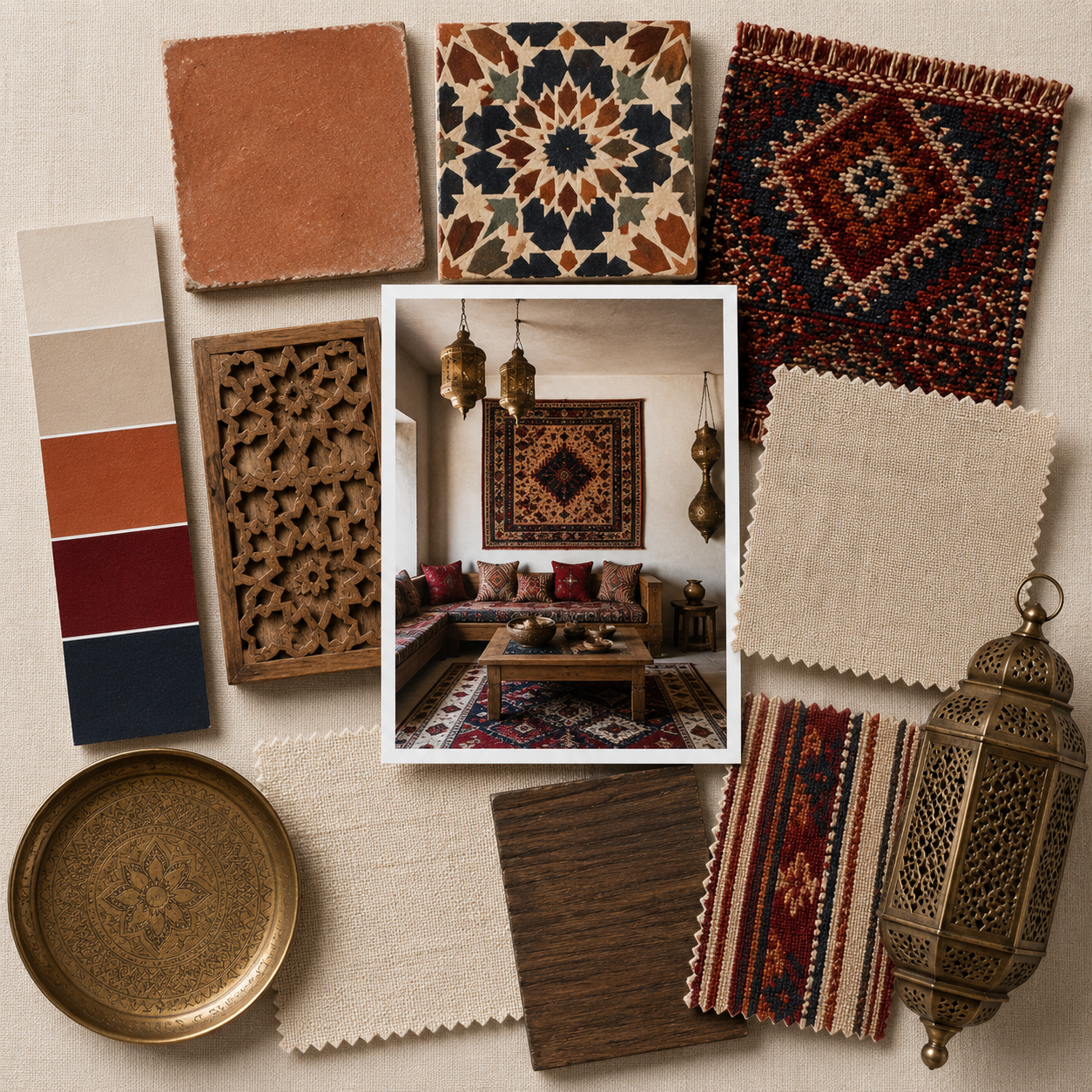
Think chalky matte paint for walls and ceilings, blue-washed timber cabinetry, blue microcement bathrooms, sapphire-tinted glass, navy or ink-stained wood, artisanal blue-glazed tiles, denim-inspired upholstery, and deep cerulean velvets or performance fabrics.
Blue-veined marble, hand-thrown ceramic vessels, woven wall hangings, and statement rugs add both tonal layering and tactile dimension.
When blue flows through both surface and material choices, the result feels luxurious, custom, and curated—exactly the type of design approach that defines 2026.


How to Successfully Color Drench with Blue
This technique requires thoughtful planning to ensure the room feels immersive rather than monotonous. The key is consistency and contrast through texture rather than additional colors.
Choose a single undertone—whether it is grey-blue, green-blue, pastel, or a deep inky navy—and apply it to every architectural element.
Walls, trims, ceilings, and doors should blend seamlessly without visible breaks. Use matte finishes for walls, satin or eggshell finishes for cabinetry, and introduce subtle sheen through furniture or lighting for dimension.
Texture becomes essential in a drenched room: think linen, boucle, wool, raw timber, and artisan plaster finishes.
Warm lighting prevents blue from feeling too cool, while natural materials like oak, cane, and stone soften the effect. Keep clutter minimal so the cocooning color envelope remains intentional and elegant.

Blue in Different Rooms: Where the Trend Works Best
Different shades of blue elevate different spaces. In living rooms, deeper blues like ink and storm create a high-end, enveloping atmosphere, especially paired with warm textures like leather, mid-tone timber, and brass accents.
Bedrooms benefit from powdery or muted grey-blues, which evoke softness and serenity. Bathrooms are perfect for slate, petrol, or microcement blues that feel spa-like and architectural.
Kitchens look stunning with navy or midnight blue cabinetry carried across walls and ceilings for a seamless, custom-built look. For home offices, blue supports focus and reduces visual distraction, making it a productive choice for color drenching.
Entryways are ideal places to create a striking first impression—drenching the entire space in a single blue shade makes the area feel curated and memorable.

2026 SampleBoard Forecast: Blue Palettes to Watch
Blue’s impact is shaped by its undertone, depth, and pairing materials. Here are five SampleBoard-approved palettes forecasted to dominate 2026:
Ocean Mineral — Chalky blues inspired by sea foam and weathered coastlines, paired with soft grey-blue and sandy neutrals. Perfect for minimal, breezy interiors.
Midnight Salt — Inky navy, deep teal, and brushed black metal come together for moody, luxurious environments with a quiet-luxury aesthetic.
Soft Horizon — Gentle sky blues combined with whitewashed oak and soft sand tones, ideal for Scandinavian and Japandi-inspired spaces.
Modern Heritage — Royal blue, warm bronze, cream, and refined textures that reinterpret classic design through a modern lens.
Blue Earth — Storm blue with olive undertones, terracotta accents, and natural stone for an organic, earthy direction that aligns with biophilic design.
Each palette allows color drenching to feel fresh, nuanced, and tailored to the personality of the space.


How to Style a Blue-Drenched Space
Once the architectural elements are drenched, styling becomes crucial. Choose warm metals like brass, antique gold, and burnished bronze to balance blue’s coolness.
Handmade ceramics, sculptural objects, and tonal art pieces bring dimension without introducing jarring colors. Incorporate natural fibers—linen curtains, wool throws, rattan furniture, jute rugs—to add warmth and texture. Keep patterns subtle and complementary.
Artwork should be soft and abstract, often using neutral tones that break the saturation without competing with it. The key is layering materials rather than colors.
This creates a room that feels elevated, timeless, and rich with character.

Choosing the Right Blue: Undertone Guide
Selecting the correct type of blue is essential for successful color drenching. Grey-blues offer a modern, understated feel and pair beautifully with contemporary minimalism.
Green-blues evoke nature and work well in biophilic or coastal-inspired interiors. Violet-blues are bold, glamorous, and ideal for luxe, dramatic spaces. Blackened navies create a cocooning, elegant mood reminiscent of boutique hotels.
Pastel blues feel soft, airy, and perfect for Scandinavian, Japandi, or kids’ rooms. The undertone should align with both the lighting conditions and the materials in the room, ensuring harmony across all surfaces.

Why This Trend Will Continue Into 2027
Blue drenching will remain influential beyond 2026 because it aligns with long-term shifts in design values.
As homes continue to become places of restoration, emotional balance, and digital detox, immersive color plays a central role in creating comforting environments.
Blue is emerging as the “new neutral”—a calming, adaptable hue that performs well in saturated applications without overwhelming a space.
Its connection to nature, water, and well-being aligns with broader trends in sustainability and sensory design.
As materials become more artisanal and homeowners seek deeper expression in their interiors, blue offers sophistication and depth while maintaining timeless appeal.
For these reasons, color drenching with blue will be a defining design language well into 2027.