Last Updated on June 2, 2026 by Rosslyn Tebbutt
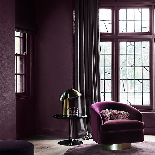
If you love a bold, unified look, color drenching is your new best friend.
Color drenching, or painting walls, trim, doors (and sometimes ceilings) in a single hue, creates a cocooning, high-end look that photographs beautifully and feels even better in person.
The key is controlling sheen, texture, and undertone so your one-color room has depth, not monotony.
Love the idea of one hue everywhere?
This guide shows you how to make color drenching feel luxe and livable by tuning undertones, mixing finishes, and adding tactility so the space reads rich, not heavy.

Let the Floor Set the Base Note
Your floor is the biggest surface after the walls, so use it as the anchor for color drenching.
How? Match paint to the undertone and value of the flooring. If the plank is low-contrast and matte, choose a slightly deeper wall tone with an eggshell/matte finish for a velvety wrap; if the floor is dark and textured, keep walls mid-tone so the room still breathes.
For a seamless look, paint baseboards the same color as walls; if your floor pattern is busy (think herringbone patterns or heavy grains), keep trim in the wall color but one step glossier to add crispness without extra colors.
Choose a style with a gently warm or cool base to steer the room. Its low-sheen surface diffuses glare, and the water resistance means you can run it through kitchens and hallways so your one-hue palette reads as a seamless flow, not pieces.
Pick the Right Hue (and Undertone) for the Aspect
Before you land on a shade, map the light. North, south, east, or west will change a color’s temperature and strength, so it’s important to take these into account.
Then pick the undertone that corrects (not amplifies) that light so everything feels even, not shouty.
Light quality changes with orientation, season, and even what’s outside your window (like trees, brick walls, water, or snow).
Start by noticing when the room is brightest, what color the light skews (warm/yellow vs. cool/blue), and how it shifts through the day.
Then choose a hue and undertone that corrects the light rather than doubling down on it, and match sheen to how much texture or polish you want the walls to show.
To test it out, paint large sample boards in your top three colors and move them around at different times of day. Hold them against your floors and fabrics to check undertone clashes.
If your flooring leans yellow, pick a wall hue with a touch of warmth; if your flooring reads cool gray, avoid icy paints that will feel flat.


Adding Lighting That Complements Your Space
Use lighting to balance the aspect and undertone you’ve just chosen. Cooler rooms feel better with warmer-looking bulbs, while very warm, sunny rooms do well with a more neutral white so colors don’t go orange.
Layer the light using wall lights to softly wash color, table and floor lamps for cozy pools, and a couple of subtle uplights to brighten corners.
Go easy on downlights (keep them away from the walls), and if you’ve got a pale, reflective floor, aim lights so they bounce gently rather than glare.
Sheen and Texture Are Your Secret to Dimension
One hue doesn’t mean one finish. Use sheen shifts and tactile layers to create definition, durability, and movement without introducing extra colors. Think of it like lighting direction for paint.
Add matte-finish walls to keep things soft, satin on trim for a subtle frame, and eggshell or low-sheen on doors for durability.
Same color, different sheens = instant depth. In hallways or studies, consider a limewash topcoat for movement; in kids’ rooms, a washable matte will make things easy to keep clean.


Ceilings and Color
A same-color ceiling intensifies the drench, dissolves hard lines, and can make standard-sized rooms feel taller and more cocooned.
If you’re unsure, shift the ceiling 10–20% lighter on the same strip (or one step grayer) to keep the wrap without the weight, and stick to a flat/matte finish to avoid glare.
Let the architecture guide you. Sloped ceilings, bulkheads, and attic rooms look calmer when you wrap the color across all planes; decorative cornices or beams can stay a touch glossier in the wall color to read as subtle detail, not contrast.
In small or dim rooms, a lighter ceiling (and even a 4–8 inch “ceiling band” at the top of the wall) lifts the eye. With skylights or very warm evening sun, consider a slightly cooler/grayer ceiling tint to balance the cast.
Furniture and Fabrics
When it comes to furniture, keep the palette tight. Choose fabrics that vary in texture (like bouclé, linen, velvet, and wool) but sit within the same color family.
For example, a navy room might feature denim-look linen curtains, a velvet armchair, and a wool rug — all within the blue spectrum.
Your flooring adds a natural counterpoint; repeat its wood tone once at eye level (think a frame, lamp base, or side table) for cohesion.

The Role of Contrast (Yes, You Still Need Some)
Even in a one-hue room, a little contrast keeps things crisp.
Treat it like punctuation. Black frames, smoked glass, aged brass, pale stone, or crisp white lamp shades stop the scheme from turning into “visual soup.” Aim for 70/20/10: 70% dominant color, 20% tonal variations, 10% contrasting accents.
Make it practical by repeating your accent twice so it feels intentional, and place it at different heights to move the eye.
Also, let the floor guide you. Go for lighter, tactile accents over dark floors and grounding, inky accents over pale ones.
Quick ideas:
- Swap chrome for brushed brass or blackened steel hardware.
- Add a pale stone tray on a dark console, or a charcoal throw on a light sofa.
- Use a bordered rug that echoes your wall hue but adds a fine contrasting edge.
- Keep patterns low-contrast (tone-on-tone) and let small hard finishes supply the pop.
Styling Shelves, Consoles, and Coffee Tables in Drenched Rooms
Wondering how to style surfaces without breaking your one-color vibe? Let shape, scale, and texture carry the interest.
Think curved ceramics, fluted or ribbed glass, wood grain, and structured greenery (olive, monstera) over lots of colors. Keep books in a tight palette too, as spines that echo your wall hue look considered.
Add one metallic piece (brass bowl, steel candlestick, or small tray) for a subtle lift that keeps the palette intact.

Wrapping It Up
Color drenching is about immersion, not overload. Read your light, match undertones to your flooring, vary sheen for depth, and layer materials inside a tight palette.
Add just enough contrast to sparkle, and lighting that flatters — not fights. The payoff is a room that feels intentional, enveloping, and undeniably yours — no feature wall required.